For more than ten years, Bolt | Peters has worked with our clients (plus a robot and clay dinosaurs) to improve the design of their sites, apps, devices, video games, and cars. We did that with 238 projects, 24 talks, 18 articles, 11 events, 1 book, 19 weird videos, and 1 app.
But the time has come for our next adventure — at Facebook. The consulting practice of Bolt | Peters will be closing operations on June 22nd, 2012.
While we’ll miss working with our amazing clients, we’re stoked about Facebook’s commitment to user experience, and the design team is a critical part of this.
What about ethnio?
Last week we announced that after five years of growth, ethnio deserved to be its own company. That has not changed. Ethnio remains committed to supporting its customers with real-time research recruiting and more. We know Ethnio is in good hands with some of the people who have worked on it for years at the helm. I will no longer be working there, but will retain ownership. You can find out more about the new team at ethnio and who will be running it by following @ethnio or watching their blog.
User Research Friday and 1197
I’m thrilled to say that our friends at User Interface Engineering will be taking over User Research Friday. They pretty much rule at events. URF lives on. And the fine folks at the New York Soho Gallery for Digital Art will be taking over our mobile photography conference, 1197. Basically, both our product and the events that we’ve enjoyed putting on will live on after Bolt | Peters closes up shop.
Feel free to get in touch with us with any questions, and you can keep up with all of us individually here. Our VP, Cyd Harrell, deserves 100% of the credit for running the consulting side of the business for the past six years. She rules. Thank you, Cyd. And a huge thanks to my co-founder Craig Peters, who has been a friend and advisor for years. But especially, all the team at Bolt | Peters past and present that I’ve had the pleasure of working with – you’ve made our success possible. Thank you guys.
Well. It’s been our privilege to be a part of the the interaction design and UX community as a consulting firm since January, 2002, and we plan to continue to work in that community as part of Facebook. I want to mention that this decision did not come lightly. Our clients, colleagues, team, and advisors are simply the best. They are our partners. They are our friends. And we sincerely thank you.
As of today, we have spun off ethnio into a separate company! You can read all about it, appropriately, on the new ethnio blog. It’s been five years since we created ethnio, and it’s finally grown enough to leave the warm embrace of our consulting firm, and this will improve things for our customers and help with a whole slew of changes we’re working on.
Very exciting news today!! We’re welcoming onboard the fabulously accomplished Jodi Leo as Director of UX and the head of our New York office. We’re beyond excited to be leaning more towards interaction design in addition to creative and accurate research, and Jodi will be helping us do both those things from New York. This also means we have started sharing space at the epic Studiomates in Brooklyn, where we expect to both make the world and our work better, and more rainbow-colored.
Photo by Nathan Strandberg and Katie Kirk of Eight Hour Day.
A few weeks ago, for a study of digital readers in university settings, our client had neither a highly trafficked website nor a large recruiting budget. No problem, we said, we can use Ethnio via Twitter. Normally this method is a great supplement to placing Ethnio code on a website, but for a student audience we were confident we could recruit the whole sample that way. It actually worked. We picked people out of the middle of the internet based on words they used in their conversations or profiles on Twitter. Here’s how it went and what we learned:
It’s becoming increasingly common to want to talk to users of technologies in other countries other than your own. Often times, this means communicating with people who are not native speakers of your language. This can be a very challenging aspect to a project, especially when it comes to recruiting, and it is something that we at Bolt | Peters have had to deal with a number of times. During a recent study of Japanese early adopters, we noticed a very interesting thing – When we tried recruiting Japanese participants over the phone, voicemails in english yielded a 0% response rate. Upon having a Japanese speaker leave the exact same message to the same potential recruits, we received a 50% response rate. The interviews were still in English.
It is critical that you, as a researcher, make the recruiting process as familiar to these international participants as possible. Even if they do speak your native language, they may not be strong speakers of it, and subsequently will feel embarrassed or nervous that they might not understand everything that is initially trying to be conveyed. This will make people not want to participate in the study, and that’s just bad news for everyone involved. Once they are more comfortable and settled into the study, it is much easier to continue doing the study in your native language.
What we did to improve response rates was translate a number of the services that we normally use into Japanese. Below is an example of the Ethnio privacy policy translated into Japanese.
And recruiting isn’t the only place where translation is helpful. Consider card sorts and other forms of unmoderated research. If there isn’t an English speaker there to guide the participant, the participant may get confused and abandon the task halfway. It’s super easy to get services like OptimalSort and Usabilla translated into other languages. You can contact the makers of these tools and inquire how you can help translate them into other languages, and they will usually provide you with a spreadsheet of some sort that contains all the text that needs to be translated. For a fairly cheap price, you can get all of the information in those translated by an agency, and voila – you’ve just contributed to making UX a more global practice. Here’s what OptimalSort looks like in Japanese.
Have you had any experiences trying to conduct UX research in other countries using the native language of the population you are recruiting from? Let us know, we’d love to hear how you do global research.
Two days after recommending ‘personalization’ to a client’s site that wasn’t making use of user viewing history, I watched Eli Pariser’s TED talk about the filter bubble. He explains how personalization online—Google, Facebook, etc.— is dangerously limiting our world view. I panicked, thinking I had subconsciously sipped the personalization potion. After all, much user interview analysis seemed to suggest that personalized suggestions—those that were taking into account viewing history—would enhance the already positive experience these users were having. For this client, I had assumed suggestions of relevant learning topics would be beneficial to their users. Am I wrong? I wonder, where do we draw the line between personalization that is harmless or helpful to our UX and that which skews our world view?
If I search Egypt, as Pariser reveals, I get a different result than you do, based on 57 signals that Google uses to personalize your search results. The biggest issue, he suggests, is that we don’t see what is being filtered out. It’s not as though certain results are ‘grayed out’ or off to the side. We just flat out see a selective list. Now, I want some information filtered the same for everyone – like the news, for example. It is disturbing to think I could be viewing news online and only see travel stories while my neighbor sees stories about riots when we both search for ‘Egypt.’ But, is there information that is actually beneficial to personalize? If I go on Netflix, YouTube, Epicurious, Yelp or Amazon do I want to see the same results as my neighbors? What’s in my best interest? Or what’s in the collective best interest? Is there a metric that we can use that helps us figure out when personalization is harmless and when we should stay away?
Most user researchers feel they get the best results if they recruit and schedule study participants themselves. We agree. There’s an art to it, which makes it hard to outsource, but it takes a lot of time. An awful lot. Take a minute and think about how many hours you or the people you work with on user research spent on recruiting and scheduling last year. And if you’re conducting guerilla-style research with friends and family or any kind of participants, then we love what you’re doing, but this is for the projects that have more specific criteria and typically require an agency or detailed recruiting effort.
If you’re doing that, please click through for more discussion and a poll.
I’m extremely excited to be nearing completion of the first big redesign of Ethnio in over three years, and want to send out a big thank you to everyone who has been using and talking about Ethnio lately for making this possible.
Still Months Away.
As part of the redesign, we’re introducing brand new monthly pricing. I’ll be alerting current customers and users over the next couple weeks, and the new pricing won’t go live for months, but I wanted to pass on our thoughts about the change and provide some details for anyone that’s interested, especially since folks like Geckoboard are explaining their pricing in such a great way. So these are the big Ethnio pricing changes:
Monthly pricing instead of per-recruit pricing
A starting plan at $49/month that is $351 cheaper than our previous cheapest plan of $400 for 200 recruits.
A new free plan that offers 200 recruits for non-profits, good causes, and any small web sites
Current paid customers get two months free
Since most people use Ethnio by placing our JavaScript code on their web site, our biggest single cost has been the infrastructure to keep up with that code living on hundreds of web sites. Even if the ethnio recruiting screeners are turned off, our server still gets a request every time someone loads a page on any of those sites containing Ethnio code. What that has meant over the last few years is that we are up to nearly 3.4 Million pageviews PER DAY for the Ethnio JavaScript.
That’s a lot.
It’s an especially large amount of traffic for a UX research and design firm of five people, with a team of one person who manages, designs, and supports Ethnio (I’ll give you a hint – that’s me). Over the past year as Ethnio has got onto more sites, we have optimized, cached, and gotten very clever with how that code is handled, but when a gigantic web site like Wikipedia or Levi’s uses Ethnio, or even hundreds of small ones, it costs us a ton. But there has been no way to correlate traffic with our ethnio pricing, because we had no way to differentiate between the downtime while our code has slowly been getting placed on many of the largest sites on the interwebs – Sony, Careerbuilders, Intuit, Mint, HP, Pogo, and on and on. Which is great. We love it. Thank you! People are doing better recruiting and starting to really use our little research recruiting web app that I started in 2004. But we needed some way to differentiate costs to our server from dormant Ethnio code. It turns out one handy thing about JavaScript is that it can very easily can track all this traffic on our customers’ web sites.
Size matters jokes are stupid.
So the new pricing works based on the size of your web site, not really how much you use Ethnio. The idea is that if you have a small web site, Ethnio will be close to free, but if you have a huge web site with lots of traffic, your cost for keeping ethnio code live on your pages will simply be more. Not crazy expensive by any means, but between $49 and $299 per month. You can cancel any of the monthly plans at any time and maintain access to your account and all data. If cost is a huge concern, you can even remove the Ethnio code and only place it live when you need it, or wrap it in a high traffic code to reduce impact to our servers. But at most of our customers’ organizations, adding and removing code is a difficult task with IT, and so we believe there is value in being able to leave the ethnio code lying around until you have a research study, and being able to instantly flip the big on/off switch inside Ethnio. You’ll also be able to send exactly the right kind of people to other tools like surveys with the new version of Ethnio, so you can begin using it as a live intercept wrapper for all your research needs. This screen shot below isn’t final yet, but this is roughly the new pricing:
The pageviews listed above mean that if you have up to 10,000 pageviews on your site or any page, then Ethnio is free. This has nothing to do with views of ethnio screeners – it’s simply pageviews of pages that contain the Ethnio code. If you have up to 25,000 page views than you should get the “Little” plan. If you have more than 500k pageviews per month, we’ll put you in an Enterprise plan. If you’re not sure exactly how many page views a particular page or set of pages you’d like to recruit from receive, you can always place the ethnio code and we’ll tell you from inside ethnio. That’s pretty much it. Would love to hear any questions or feedback in the comments, via twitter, or via email at info@ethnio.com.
We’re putting the final touches on User Research Friday 2010, which is coming up on November 19th (and the 18th for workshops). As part of making sure the day is filled with learning and joy, we’d love your help with two questions about some of our content:
1. What would you like to hear about from Darrell Benatar, the CEO of usertesting.com?
He’s agreed to come talk if there’s something of clear value he can share with a group of usability professionals. Want him to come? Send a great question or two you’d like to hear him answer. Keep in mind, he’s created a successful product that offers self-moderated research, but it’s not like he’s a practitioner who created that whole category. If you’re not familiar with the tool, here’s a detailed review.
2. Is it possible to discuss eye tracking without a war?
There seems to be two entrenched sides to eye tracking – those who think it’s a waste of money and time, and those who think it’s valuable. Since we have all been to panels that wasted our very life essence, we’d like to make sure our eye tracking panel is valuable for you. What questions or topics would you like to hear about on eye tracking from Jared Spool, Nick Finck, Leslie Cachon, and Brian Krausz?
Leave your questions as comments, or if you’d prefer to remain anonymous, email them to Nate and he will guard your identity. For reals.
Our own Presidente, Nate, was invited to the exclusive Phoot Camp this year, which was sponsored by Virb and put on by the epic Pictory (both just happen to be examples of phenomenal interface design). While there, Nate took this shot of amazing photographer Derek Wood riding a bicycle named “The Fury,” which nate purchased along with Apple Creative Director Michael O’Neal. It happened to become the very most interesting photo on Flickr for August 9th, which almost 8,000 views, 500 favorites, and 120 comments. NO BIG DEAL. If you like our photos, you’ll love our UX research. Right? Ok, maybe, that’s a stretch.
When Whitney Hess tweeted this week about needing help with a remote usability test, we jumped on the opportunity to help. “Simple,” we said! “That’s what we do everyday!”
Well, not exactly simple but do-able without too much effort.
Here’s what Whitney told us she needed:
A way to call a user in her home
Have that user share her desktop (Mac or PC)
Ask the user a few questions, and observe what the user does
Record both the audio and video in a single file — on a Mac
Take notes all the while
Oh, and make it low cost while you’re at it
And here’s what we told Whitney:
First, you’re going to need the follow “equipment”:
A laptop and extra monitor
A USB headset
A set of headphones
GoToMeeting (GTM)
iSHowU HD
Optional: An Fiio amp to boost the audio in the headphones
Then, setup GoToMeeting to manage the screensharing and audio. We keep a persistent meeting ID in use, which we bookmark on a landing page. This landing page is where we go to launch the meeting (as the organizer), where our clients connect, and where we direct our users. GoToMeeting doesn’t use a browser plugin; instead they use Java or ActiveX to deliver an application that runs at the OS level. It works on both Macs and PCs, although Mac users can only share their primary desktop.
These are the settings you want to use in GTM:
Basically, you want to disable a bunch of features to make it feel like it’s just you and the user in the meeting. This includes disabling the Attendee List and turning off Entry/Exit beeps. Unfortunately, GTM always announces the number of callers on the line when the user connects either by phone or mic & speakers.
Pay attention to the Audio Output setting: you have to hijack the audio from GTM and send it to iShowU HD to record. In fact, you’ll need to install that driver (Soundflower 2ch) to allow you to record audio from native applications.
“MUTE ALL” is also this wonderful trick we learned from the good folks at GTM. If you do it the very first thing, then everyone who joins the meeting afterwards will come in muted by default! This lets you rest assured that any clients who connect late won’t be heard by the participant.
Next, use iShowU HD to record just a portion of your screen. You can use pretty standard settings for video capture, but make sure you choose the correct Audio settings: turn on ‘Audio from Applications’ to capture that audio stream from GTM that we hijacked and the Mic Input from your Headset (DSP55).
This is what the Advanced -> Audio panel should look like:
Finally, make sure your Mac System Preferences are set properly. This is used to make sure you can hear and communicate during the call! Set the output to your headphones, and the input to your USB headset.
Here’s what the settings look like:
Good luck getting things set up! This actually works brilliantly — but we’re always on the lookout for new and better solutions. Let us know what you’ve found that works for you!
I had the privilege of Jared Spool attending and critiquing some of my recent talks, and in preparation for a UIE webinar I’m giving, he took time to rip me apart give me some awesome feedback. His advice reminded me of notes I took almost ten years ago at an Edward Tufte seminar about giving great talks, and so the next logical step was to make old-timey boxing photos of them both and write a mashup of their talking tips. RIGHT? Both Jared Spool and Edward Tufte are known to be kick-ass speakers in the technology field – Tufte is all up in the freaking white house, and Jared speaks roughly 400 days a year around the world. I think we can learn a lot from their advice, and despite the artificial conflict introduced with boxing pictures, their tips are mostly complimentary.
Tufte would simply like everyone who gives a talk to be ready on-time and finish early. Simple right? He thinks nobody ever complained at having an extra few minutes for questions at the end. He also makes the point that we have a tendency to dumb down information too much, and feels that this is disrespectful to the audience. He says that just because people show up for your talk, they are not all of a sudden stupid. So speak to them like you would a trusted colleague, and finish a few minutes early. You’ll leave people feeling grateful and they can always come talk to you with any burning questions. This shows respect for peoples’ time, in addition to their intellect.
2. Don’t Be The “Fun Cool Guy” at The Expense of Content
Jared’s first feedback for me was that I sacrificed content in previous talks to seem fun and cool, and still did this a little in my most recent talk at Interactions ’10 in Savannah. I tend to agree, so this one is pretty straightforward. I concentrated more on creating fun slides and jokes, which meant sacrificing some focus on the serious meat of the talk. I’m sure nobody would look at this blog post here with 4000px of photos and 945 words and make the same criticism. But I would add that doing the opposite – putting your content at the expense of audience engagement – also sucks. Ever been to CHI?
3. Your Intro was Seven Minutes. Stop That.
As long as you have a somewhat established background in what you’re giving your talk about, skip the introduction and dive into the material right away. Jared timed my introduction and it came out to seven minutes. He suggested that was “way too fucking long,” and that I could have given contextual background information at the relevant parts of my talk. For example, when I mention how we did remote card sorting for Oracle, say that it took over 8 years and 200 studies to experiment with these methods. If you consider this paragraph analogous to the structure of a talk, I just nailed this very principle. Oh, and I’m Nate Bolt. This coincides almost perfectly with what Tufte calls the “Particular-General-Particular” strategy. Speaking of which…
4. Particular General Particular (PGP)
The first thing you do in your talk, before you even say hello, is to give your audience a nugget of information – something of value. Say right away that less than 5% of user research is conducted remotely, to give people an information pay-off right away. Then explain it in general. Repeat. This point is so crystal clear it’s almost ridiculous, but I dare you to remove your boring intro slides and canned spiel about who you are. It feels wrong. But it works great.
5. Reference Specific Work Examples
Jared said that the most interesting points of my talk were when I referenced research we did for Princess Cruises as a success, or Habbo Games as a failure. For Princess, we were able to recruit groups of family members to conduct research with them about their cruise-planning process, and it turned out that their behavior (emailing each other and not talking) didn’t match their description of the planning process (we all talk about it). Are you wondering about Habbo now? See what I just did there?
6. Giving a Talk Means Never Having to Apologize
Don’t call attention to the meta-structure of your talk and thus take focus away from the content. A friend of mine, Steve Dodson, calls this “editorializing” during a talk. For example, avoid the temptation to say “Sorry this slide is a little hard to understand, but I’ll explain it.” That is a huge mistake. Nobody will notice anything wrong with your slide, and if they do, let them silently judge you and keep going. For the 90% of people that didn’t notice your mistake, you will have never interrupted their experience.
7. No Telegraphing
Jared pointed out that in my most recent talk I told the audience three times that I was going to “cover this more in detail later,” and he was quick to make it clear that this was a really bad idea. It pulls the audience right out of the talk. It’s also a form of editorializing from the last point, and it starts people thinking right away about something else that will happen in the future. This means they stop paying attention to what you are currently saying because it has suddenly become less interesting and important. My tendency is to want to assure people that I’ll cover everything they might be wondering about, but the truth is if I respected my audience more I would know they have the patience to at least wait until the talk is finished to judge me. So don’t be afraid to be judged at the end of the talk, instead of during the middle.
8. It’s a Story, Stupid
If there is any possible way to construct a traditional Hero’s Journey, or Monomyth, do it. Don’t skimp on the story in your talk. Even something as mind-numbingly boring as remote user research can have a story built around it. Jared’s suggestion was to tell how we begin looking at this vast world of UX tools and methods, whittle it down to one, what successes and failures we ran into with that method, and how in the end we triumphed helping our clients build some amazing experience. I’ve since created a character named “Marv,” inspired by our stop-motion animation studio, to use in presentations:
9. Leave Something For the Q&A, Bro
If you neurotically anticipate every question your audience could possibly have, and include answers in your slides as a desperate attempt at seeming wise, there will only be silence at the end. Think about a few potential common questions about your talk, and leave room for the audience to ask those questions. You know what’s coming, and they get to ask. This is also called “Winning.”
Watch Me Fuck Up and Learn
Now for the most embarrassing part. I make almost every single one of these mistakes in my talk at the IxDA conference “Interactions” in February of 2010. It’s gut-wrenching for me to watch this and see how badly I violate most of these rules, but maybe you can learn from my mistakes. MAYBE. Got any tips of your own? Think you’re tough enough to take on Tufte and Spool with a disagreement? Drop it all in the comments.
The guys over at ZDNet who cover all things Mac-related have written up a quick summary of our recent comparison of mobile interaction with the Square payment system between the iPad and iPhone. Cool to see this article get so many comments and shout-outs. Both links below:
That last one is really only included as proof that this blog has sort of been eclipsed by our use of Twitter. I mean we use this so much less now. Kind of crazy. I never would have thought this, but maybe we’ll just replace this with a nice-looking summary of all our tweets.
Come hang with us in San Francisco or attend remotely on May 6th from 9am – 4:30pm PST. We’re holding our third Escape The Lab workshop on remote UX research methods and tools. You get hands-on training with the latest moderated and un-moderated remote UX research tools.
Space is limited as we’re only allowing 10 in-person and 10 remote attendees, so register soon. It’s about 50% sold-out right now. Also, we’re giving away two FREE spots for whoever tweets the best answer to why they love or hate remote research with the tag #ETLAB. Date: Thursday, May 6th, 2010 Time: 9am – 4:30pm Place: Bolt | Peters User Experience at 576 Natoma Street, San Francisco, CA Cost: $399 In-person or $199 Remote. $299 for URF Alumni. More info: http://escapethelab.com/
Hope to see you there!
[Guest author: Rolf Molich owns and manages DialogDesign, a small Danish usability consultancy that he founded in 1993. Rolf conceived and coordinated the Comparative Usability Evaluation studies CUE-1 through CUE-8 in which almost 100 professional usability teams tested or reviewed the same applications.]
Usertesting.com – A usable and useful recruiting service
Usertesting.com offers unattended, 15-minute usability test sessions at reasonable prices with participants from the US, Canada and the United Kingdom. I have some experience with their service. I am pleased with it, but you should be aware that they really excel at recruiting users from the most broad demographics to spend time looking at your site, not usability analysis.
Usertesting.com home page
“Use it and your site will get better”
On their home page, Usertesting.com quotes Evan Williams, Twitter Co-founder: “Use it and your site will get better”. I respectfully disagree. Usertesting.com is a great recruiting service, but a skilled usability professional is still required watch the videos and extract useful usability recommendations. The opinions from the participants are mostly worthless. Participants’ behavior, not their opinions is important.
I used Usertesting.com in a recent comparative usability measurement study of Budget.com. Usertesting.com ran about 30 sessions for me with about 20 users. Since my five car rental tasks on Budget.com took about 25 minutes to complete, I had to split the tasks into two sessions and ask their customer service to get the same test participants to do two sessions with different tasks. This worked like a breeze, but it took me some extra time to handle and write instructions for two sessions.
19$, 29$, 39$, and counting?
At the time of my study in April 2009, Usertesting.com was charging just 19$ per test participant. Shortly after, they raised the price to 29$ per test participant. Now they have announced yet another price increase to 39$ per test participant. At 19$ per participant their price/performance ratio was amazing. At 29$ it was good. At 39$ I am not so sure, considering that you only get 15 minutes test time. At 4 x 39$ = 156$ per hour their service is less competitive compared to traditional recruiting. Despite their price increases, they still pay their participants 10$ per session.
High quality
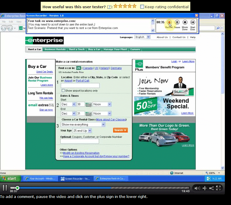
Amazing turnaround time. In late December 2009 I used Usertesting.com to run three test sesssions of the Enterprise.com car rental service. The test sessions were completed within one hour from the time I submitted the request. Because of the time difference between the US and Denmark where I live, I sometimes submit requests at 4 am East Coast time, but even these requests are honored almost instantly.
Their test participants are great. So Usertesting.com’s screening process seems to work. One or two participants out of 25 were rather talkative and offered 10 minutes of worthless personal opinions about the website in addition to their helpful task solutions. Fortunately, this happened rarely and I simply filtered out the opinions and looked at actual behavior.
Video and sound from their recordings is good. I never had a problem understanding what a participant was saying or doing. See the sample screen from a recording below. In contrast, I’ve had professional usability consultancies who without blushing sent me usability test recordings where the video was blurred or the sound was a loud humming.
Screen showing usertesting.com video replay
Their customer service is excellent. I got a fast and sensible response each time I asked them a question or submitted a comment.
Their customer service told me that their agreements with participants allow the clients any use of the recordings they want – including public presentation of the videos. This seems ethically defensible because you can’t see participants’ faces and you mostly don’t get their names.
A few limitations and caveats
For unattended test sessions where no moderator is available to correct misunderstandings on the spot, you may want to test your instructions to test particpants carefully. You must provide your own pre-session interview questions and the all-important debriefing questions.
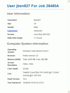
Usertesting.com only provides rudimentary demographic information about participants as shown in the screenshot below. If you want information about approximately where participants live, what their profession is and if they’ve used the site or similar sites before, you must use precious test time to ask in your test instructions.
Rudimentary participant demographics on usertesting.com
Usertesting.com’s setup allows the participant to interrupt the recording at any time. This may be OK for qualitative testing, but it spoiled a few of my task time measurements. Also, in a few cases test participants seemingly left the session for about 5 minutes without explanation – no sound and nothing moved on the video. In one case it seemed to me that a test participant had rehearsed the test questions before they clicked the recording button and started the real session. I must add, though, that if I expressed just the slightest bit of dissatisfaction with a participant, their customer service immediately refunded me what I had paid. Of course moderated sessions aren’t perfect either – and most often they don’t have a money back guarantee.
Some of my colleagues have argued that Usertesting.com offers “professional” test participants. It is true that on 2-3 occasions test participants inadvertently showed me their test session dashboard which showed that they had been doing about 10 test sessions recently. Personally, I don’t mind this. I have yet to see a participant who was so experienced in user testing that it prevented me from getting the data I wanted.
All in all: Recommended
Usertesting.com has a great concept and implements it with care. Before their recent price increase, I would even have said “Highly recommended”.
This was originally posted on the GoGamestorm blog on August 16, 2010. We’ve used this activity in several client brainstorming meetings with much success! Give it a whirl and report back on your results!Objective of play: Improve the onboarding process of a product or service. Number of players: 5-30 Duration of play: 30-60 minutes How to play:
Everyone is handed a piece of paper and a marker.
Participants are asked to imagine that the product/service being designed is a party or event and to create an invitation.
Invitations should be as detailed and realistic as possible — they might include an inviting statement (“Join us for…”), what to bring, what the host (company) will provide, time, dress code, directions, RSVP info, and any other information guests might need to enjoy the party. It could also be done in the form of a Who, What, Where, When, Why invitation.
Participants are encouraged to refine their invitations in multiple iterations. Allow at least 10-15 minutes for invitation writing.
Once everyone has completed their invitations, the facilitator calls for ideas on each element of an invitation in turn:
What did you call the party?
Did anybody have a dress code?
What did you say about refreshments?
What do guests need to bring?
What is the party actually for?
How will guests get there?
Next, participants read through their invitations in turn. The facilitator takes notes and posts the themes on a white board.
After everyone has presented, participants jointly narrow and refine the ideas, keeping in mind things like:
What metaphors have emerged? How might they contribute to ideas for the onboarding experience?
Which elements are crucial to the invitation?
Which ideas represent the right feel for the brand and offering?
Finally, the facilitator engages the group in sketching or another idea generation process to implement the refined invitation as a draft of the onboarding process.
An example party invitation.
Strategy: This is essentially a metaphor-generation game that allows participants to imagine how they want to engage their audience. Detail is good, and players who go whole-hog with imagining their party as anything from a white-tie gala to a potluck are likely to be successful as long as they carry it through. Interesting discussions will ensue when participants go for different versions — are we a come as you are party or do we have a festive dress code? Must you RSVP or can you just show up?Why invitations? At Bolt Peters, we often think of successful technology products as being more than just friendly. They are literally inviting — asking their audience to use them, rewarding them when they do, and asking again for higher levels of use and engagement. When deploying a conversion funnel, especially for gradual engagement, an enticing and escalating invitation is a critical piece of the puzzle.
[Guest author: Brynn Evans is a digital anthropologist, design researcher, and author who studies social interaction design and social search. She extends a thousand thanks and a bear hug to Tony Tulathimutte for help in editing this post!]
What is social interaction design?
Social interaction design (SxD) is the practice of designing for person-to-person interactions mediated by a computer interface, going beyond pure usability and human-computer interaction. Even fairly solitary experiences like editing a Wikipedia page occur in a social context in which other users’ past interactions influence what new editors contribute.
“It’s the interactions among users that informs design.” —Adrian Chan
Vark.com is a question-answering service that routes users’ questions to people in their extended networks who may have relevant knowledge of the topic. The original service operates through IM, Twitter, and email; more recently an iPhone app has been developed.
Let’s consider the difference between the mobile and desktop experiences of Vark.com. Both asking and answering activities work rather well in desktop email and IM. In contrast, responding on-the-go is awkward—more often than not, we’re distracted, hurried, or unable to type a coherent answer without bumping into a fire hydrant.
There’s also an assumption that the answer resides solely in our heads, when in reality, providing an answer often requires sharing links or performing a quick search—that is, we may not have the answer immediately on hand, but we know where to look.
Furthermore, successful answers often manifest as conversations on the desktop (example above), in which messages are exchanged in a back and forth manner so that the questioner can clarify her question and the answerer can refine her response. This type of sustained interaction is much harder to establish with on-the-go users.
Finally, iPhone prompts (right) often lack enough information about the nature of the question or your relationship to the questioner. One reason for Vark’s success is that it seeks out answers from people within an extended, personal network, naturally building trust and accountability into the system. But without knowing how you know the questioner, the iPhone app experience feels instead intrusive and disruptive, and lacks any strong social motivator to respond.
Why is remote research useful for SxD?
Traditionally, user-centered designers conducted field studies or shadowed someone to learn more about their practices. The digital space complicates matters—not only is it difficult to shadow someone, but people’s actions are so fluid and varied that it’s hard to isolate specific behaviors in order to study them.
Remote research has emerged as a great way to do needs-finding for SxD, for three reasons:
First, it’s hard to recreate interactions between two or more people in a lab setting. Last year when I was studying user interactions during social search tasks, I realized that I needed to talk to multiple people: both the user who posed the question as well as the people who provided replies. I started by observing the questioning process: how the question was phrased, which communities or individuals were questioned, the historical relationships between the parties. Then I explored the answering process: answerers’ perception of the request, why they chose to reply, if they had a history of interacting like this.
What’s interesting is that answers provided over social networking sites (like Twitter and Facebook) were mostly jokes or “nudges” to attract the user’s attention (“Hey, remember me?”). But answerers in private channels (email, IM, phone) were more serious and thoughtful because people were contacted directly and had longstanding relationships with the user (“She asked me personally, and she’s helped me in the past”).
Second, social interactions unfold over time, and their repercussions aren’t always apparent in a hour-long lab study. I recall one user in my social search study who asked a question on ping.fm. He received a prompt reply which “seemed right”, so he reported it as his “final answer”. I followed up two days later to see if he had received any other replies. In fact, the conversation thread on ping.fm had progressed, and the community had collectively concluded that the earlier reply was incorrect. This observation was only made possible by the passage of time.
Third, social interactions are best understood within the context where they occured. Not just physical location, but also past history (between the people interacting) and reasons for having the interaction. For example, my sister tweets about her new startup, but I’m not familiar with her a field and don’t have a professional relationship with her, so I seldom reply to her tweets. However, when she emails, calls, or writes on my Facebook wall, I reply instantly—even on an unfamiliar topic. If you were only studying my Twitter use, you might wrongly conclude that I’m an ingrateful sister, but this interpretation would be taken out of the full context of my relationship with her.
Thus, whether you’re designing for healthcare, fitness, games, dating, or online privacy, it’s critical to gain insight into where, when, and why people to act the way they do. Community engagement through social media will differ substantially depending on people’s personalities, reputation, location, local culture and rules, nature of their relationships, and history of the community. Remote research methods—like experience sampling, remote observations, and critical incident surveys—are great tools for understanding the many facets of social behavior, and suggest productive avenues for pursuing SxD.
The new 2010 Ford Fusion, presented today at CES, has a heavy focus on in-car technology—SmartGauge fuel consumption meters, in-car wifi and touchscreen apps, voice-activated Sync technology, and iPod controls all introduce a huge amount of user interaction. As twitterer @zsazsa says:
“What impresses me most about Ford keynote isn’t their tech, but the huge amount of user research they’ve done and acted on.”
Clearly this is a huge user research task, and IDEO was called in to do design and research. As the Movement Design Bureau comments, the research project sounds pretty far-ranging:
The Smartgauge team worked closely not only with designers and engineers within Ford, but with the most famous user-design/research guys of them all – IDEO, and conducted extensive, ethnographic research – not only with hybrid drivers, but with those who drove hummers, bicycles, and even professional athletes and their trainers.
We’ve done some in-car ethnography ourselves, and we think it’s a fascinating area for innovative research—the inside of a car is an environment with a totally unique set of design constraints and user needs, and it’s a place where (for better or worse) Americans spend hours every day. We’re curious what the professional athletes were doing in that study, but word up to Ford and IDEO for working to understand how people use technology in their cars.
Above: No two ethernet snowflakes are exactly alike. This photo was taken from the roof of our office by the boltron.
We Helped Stanford Battle H1N1 Using the Power of Design and Google
Bolt | Peters recently advised Stanford University and various public health departments on the design of a Google Sites template for H1N1 and general emergency information. It was a fascinating design challenge on a breakneck deadline, and we’ve documented the whole process on the B|P blog!
It’s well-known that remote research reverses climate change and cures swine flu, but did you know that it also makes an amazing holiday gift? We’re giving 15% off on all remote studies, training, and expert design evaluation that’s booked through the month of December. It doesn’t have to be completed, but just started. You know how that goes. Drop us an email!
Time-Aware Research is the Heart and Soul of Accurate Behavioral Data
By now UX researchers are familiar with the importance of understanding the usage context of an interface–the physical environment where people are normally using an interface. Remote research opens the door to conducting research that also happens at the moment in people’s real lives when they’re performing a task of interest.
It’s only two blocks from our current office in SOMA, San Francisco, but after three years at our current awesome space, we finally have to move. Luckily we found a sweet 4,000sq ft space close by that will be our very own whole building, with room for workshops, events, and our rocking team of six UX researchers, designers, cognitive scientists, artists, and rappers. We just signed the lease and will be all moved in by the new year. In addition, we’ll be sharing the space with our new developer homies at Exygy. Stay tuned for our 8yr party / house warming in 2010!
Web and Flow: A Short History of the Interwebnetz in SF
They say that the only industries that made money after the Gold Rush were shovels and blue jeans. In the last fifteen-or-so years, SF has seen another rush, this time to the Internet; so what will be the real cashmaker this time around? Our bet’s on iPhones and skinny jeans. Anyway, we’re working on a stop-motion video timeline of Web companies in SF. We could really use your help making sure we get the history right, so please check out our list and add any web companies we’ve forgot or messed up as a comment. One rule – the company has to still be around. So like Flickr counts, but maybe not Pets.com. And as Dan Harrelson pointed out, we will consider companies that enable the web also, in addition to startups and agencies. Anyone all up on the net.
We’re on Yelp now! Want to praise us to the skies for a past user research study, design project, or our little-known sideline in pastry catering? Want to nag us for the time we left the cake in the rain? Follow that link!
We’re giving 15% off in December on the following services:
Live moderated remote research: We recruit your website’s visitors using Ethnio and call them right away to conduct a live, 40-minute behavioral research study. You get to watch and participate while it all happens. Great for formative design research, usability research, and design validation!
Automated research: capture the behavior of hundreds of users on specially-designed tasks to get answers to specific usability questions.
Expert design evaluation: After nearly 10 years and over 200 user research projects, we can evaluate your product for major and minor design and interaction issues.
Remote research training: Want to learn how to recruit users live from your website, use screen sharing tools, and record and edit remote research sessions? We’ll train you.
Weird, insane user research projects: Got a user research project that you have no idea how to approach? We’re experts at finding new ways to research stuff—check out our automotive and video game research projects for examples of the crazy methods we’ve come up with.
Imagine the look on your design team’s collective face as they get answers to their toughest interaction design problems. I mean, what else were you going to get them, a leopard-print Snuggie? A Chia Obama?
To get started, fill out the form below, and we’ll get back to you, usually in less than a day!
Bolt | Peters recently collaborated with Stanford University’s Bill Behrman on designing the Google Sites template for local governments to use as a backup to deliver information on the H1N1 outbreak, and also disasters in general. Here’s the story!
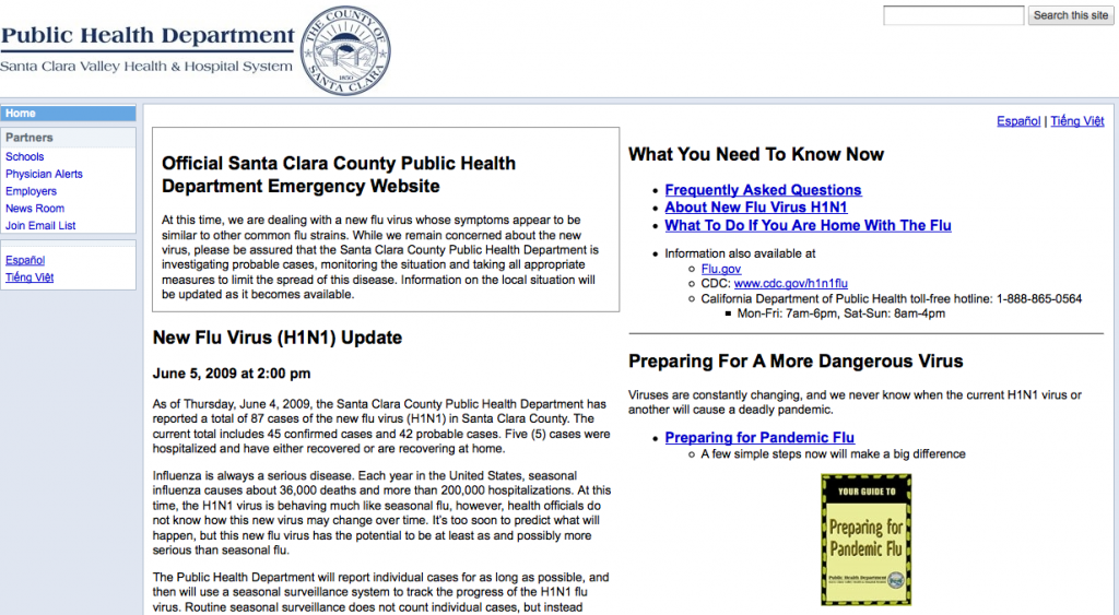
Stanford's original stopgap design (click to view site)
After the site went up, Stanford trained the Santa Clara County staff, who maintained it and added their own information. Santa Clara County had to get the site up in a hurry, and they were just happy to have a site that could handle the traffic and get the information out—which is to say, there wasn’t a whole lot of time to think about design.
This experience made it clear that it would be valuable to create a well-designed, easy-to-edit template for local governments to distribute information in case of emergencies—not just H1N1, but any public hazard, including floods, earthquakes, wildfires, and so on. That’s where we came in.
Bill contacted us in late October with the original draft of the website. Since it was important to make the site available as soon as possible to deal with the ongoing H1N1 outbreak, so the timeline we had for design recommendations was really brief—just a few days. With that in mind, we got to work.
Spotting the Problems
Because of the layout restrictions, our design evaluation focused primarily on information design. We had two main issues with the early design, along with a handful of usability tweaks here and there.
1. It lacked a clear visual hierarchy.
With two columns of equal width and mostly indistinguishable boxes filled with text, it was hard to tell at a glance what information was urgent, time-sensitive, or recently added.
2.Big chunks of info, no organization.
The info wasn’t grouped into meaningful categories—there wasn’t much visual or spatial distinction between contact info, prevention info, calls to action, and so on, making it difficult to zero in on information even if you know what you were looking for. Also, the info came in big blocks of unscannable prose, and deep reading is the last thing you want to do when you’re trying to learn about the tsunami headed your way.
3. It didn’t anticipate the distinct needs of the most critical user segments.
There was plenty of good info on the site, but it was never clear who a given piece of info was for—you couldn’t scan the page headers and think, “Yeah, there’s what I’m looking for”. Instead it had a “general audience” feel to it; the info didn’t take into account that different groups might have different needs and different levels of urgency.
4. Buried info.
Vital info on vaccines, symptoms, and SMS / Twitter updates was absent from the front page entirely, lurking deep in the navigation.
Our Top Recommendations
To keep editing simple for the the local government end-users who would be using the template, we had to stick to using the WYSIWYG Google Sites editor, which meant no custom CSS and very little control over layout. We also had literally a single day to make our recommendations and synthesize them into a first-draft mockup—the result wasn’t pretty, but got our main info design recommendations across loud and clear.
Our first stab at redesigning the H1N1 template
Redesign Goal #1: Prioritize information according to the urgency of visitor need.
Our design takes into account that there are different “general public” user segments with different goals, and that there are tiers of urgency and priority. From most-to-least urgent, we identified these segments:
People infected with the flu: Seeking immediate help
People worried that they might have the flu: Self-diagnosis
People concerned about catching and/or spreading the flu: Preventative measures and vaccine info)
People just curious, staying informed: Information about travel restrictions, public response, news updates, deep flu info.
The structure of the site was altered to serve each of these segments:
1. We added a page-width alert box that would be displayed to convey urgent, time-sensitive info—this is a common feature on many of Google’s sites, as well as CNN.com.
2. A yellow-shaded box to give the highest priority group, currently affected individuals, clear instructions on what to do.
3. The left-column contains info on self-diagnostic and preventative measures for at-risk or concerned individuals.
4. The top-right contains info on vaccines; below is links to deep info, research, and update notifications. Though the Google Sites template didn’t allow us to resize the right column, we noted that it should be made smaller than the left column.
5. The left sidebar navigation was reserved for redundant quick links to most important info, as well as links to pages for specially affected individuals and organizations.
Redesign Goal #2: Reduce block text down to easy-to-scan lists and chunks. Cut the bureaucratic BS.
We broke down the block text to keep from overwhelming users with too much difficult-to-scan information upfront. Lists were kept to under 8 items long, unless they broken down into categorized sub-lists; text was kept under five lines. All information that couldn’t be condensed in this way was moved to lower-level pages, and linked from higher-level pages.
Users don’t need to know what the mission statement and goals of the organization are; they just want to know if and how they are personally affected, and what they can do in case they are affected.
Redesign Goal #3: Use informative headers that directly address user goals, and which give all users clear next steps.
All types of visitor (e.g. directly affected, at risk, concerned, just curious, administrative, medical, etc.) should be able to tell by the header if that information is “for them”. We tweaked the headers to make it clear what kind of info you could find in each section. We also made it clear what, if anything, each user segment needed to do:
Immediately affected individuals are given step-by-step instructions on how to deal with their emergency situation(s).
At-risk individuals are given step-by-step information on preventative, precautionary, and self-diagnostic measures.
Individuals seeking non-urgent information can be given supplementary external information resources (by phone, online, and downloadable / printable) and means to stay updated (by email, text, RSS, Twitter).
Urgent contact info is immediately visible in the right sidebar.
The First Revision
After we sent over our recommendations and mockup, Bill sent us a nice note a day or two later:
You’ve convinced us that we have to completely rethink and redesign the site from scratch, so your style guidelines come at a very good time. I can’t thank you enough for opening our eyes to how we can do this in a much better way. I think we can create a site that works much better than the original site.
…and then a few days after that, Stanford sent a revised version over to Google, who worked with the design firm OTT Enterprises to create two new designs with some added visual design flourishes.
Unfortunately we don’t have permission to show you this revision yet (working on it), but it wasn’t bad—it was certainly cleaner and better organized, easier to scan, less dense. There was, however, a large distracting green gradient background, some empty space in the sidebar columns, a few stock photos, and a muddled color palette (green, blue, yellow, and gray).
Our second batch of suggestions focused mostly on visual design and layout. Just a few of them:
Visual Design
Get rid of the gradient background; it’s distracting and confuses the emphasis on different parts of the site, since it runs behind multiple different elements.
Get rid of the green coloring, which is tertiary to the blue and yellow. Instead, use several shades of blue as the primary color and a little light beige or light grey as a secondary trim. Blue signifies authority, calmness, trustworthiness, etc., which are of course appropriate here. Notice how almost every major government agency’s website (including the CDC) uses dark blue and gray as the main colors.
Remove the stock images, including the CDC and Flu.gov widget images, which look like ads. The phone and email icons are fine, however.
Rather than images, make the content headers stand out with size and strong typography—”make the content the focus” is an old web design adage, and the content, in this case, is the flu information. Here are a bunch of sites that use typography, font size, whitespace, and bold layout to create emphasis, using few images [list of a bunch of websites].
Layout
Header and upper-page content takes up way too much space—note that the important info (“If you or your child…”) doesn’t begin until more than halfway down the screen. Compress.
I like how Design #2 places the alert and contact info in the sidebar; in Design #1 the sidebar is wasted space. This frees up space to move important info (Vaccine and How to Care for Someone With The Flu) up to the right side.
This design consists mostly of links to deeper pages, but there’s definitely room to put more specific, useful info right on the homepage: symptoms, preventative measures, vaccine info (see our original design)
Get rid of the Contents box.
The Results
Stanford started over once again, aided by our style guide and input from OTT Enterprises. After further iterations in Google Sites, they handed it over to the Google visual designers, and here’s the before-and-after:
Google Sites template, super rush draftGoogle Sites Public Health Template 1.0
Want to give your feedback?
As with all things on the web, the template is a design-in-progress, and will be improved as time goes on. Here’s where you can send feedback for the Public Health template and the All Hazards template. Since these Google Sites templates are available to everyone, you can even make your own design edits and mock up improvements.
Or if you just think it’s great and you just want to use it yourself, here’s the complete list of links:


 3. Your Intro was Seven Minutes. Stop That.
 5. Reference Specific Work Examples
 6. Giving a Talk Means Never Having to Apologize
 7. No Telegraphing
 8. It’s a Story, Stupid
 9. Leave Something For the Q&A, Bro
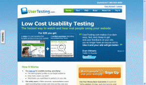


")

