As of today, we have spun off ethnio into a separate company! You can read all about it, appropriately, on the new ethnio blog. It’s been five years since we created ethnio, and it’s finally grown enough to leave the warm embrace of our consulting firm, and this will improve things for our customers and help with a whole slew of changes we’re working on.
Author: Cyd Harrell
Categories
NY Junior Researcher Internship
We have an immediate opening for an intern at our acclaimed UX and design research team (in the New York office at Studiomates!).
Categories
Jodi & New York
Very exciting news today!! We’re welcoming onboard the fabulously accomplished Jodi Leo as Director of UX and the head of our New York office. We’re beyond excited to be leaning more towards interaction design in addition to creative and accurate research, and Jodi will be helping us do both those things from New York. This also means we have started sharing space at the epic Studiomates in Brooklyn, where we expect to both make the world and our work better, and more rainbow-colored.
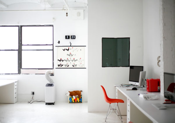
Photo by Nathan Strandberg and Katie Kirk of Eight Hour Day.

A few weeks ago, for a study of digital readers in university settings, our client had neither a highly trafficked website nor a large recruiting budget. No problem, we said, we can use Ethnio via Twitter. Normally this method is a great supplement to placing Ethnio code on a website, but for a student audience we were confident we could recruit the whole sample that way. It actually worked. We picked people out of the middle of the internet based on words they used in their conversations or profiles on Twitter. Here’s how it went and what we learned:
Most user researchers feel they get the best results if they recruit and schedule study participants themselves. We agree. There’s an art to it, which makes it hard to outsource, but it takes a lot of time. An awful lot. Take a minute and think about how many hours you or the people you work with on user research spent on recruiting and scheduling last year. And if you’re conducting guerilla-style research with friends and family or any kind of participants, then we love what you’re doing, but this is for the projects that have more specific criteria and typically require an agency or detailed recruiting effort.
If you’re doing that, please click through for more discussion and a poll.
Categories
And Now, Computers… for WOMEN!
Hear that? It’s the sound of the glass ceiling shattering into a million pieces—because now, for the first time in HERhisstory, Dell has made their computers accessible not only to men, but to female people!

Dell has launched a new site for female laptop buyers, Della, which shows you how to use your computer to “track your food intake”, “find recipes online”, and “watch yoga videos”. (Note how the computers match their owners’ clothes: because we all need a $1200 accessory. Also note “cherrydoll”‘s authentically mispunctuated comment: because syntax is for boys!)

Above is a picture of me, yes, a woman, with the last Dell I will ever own. It’s my current laptop, and I chose it because I needed a computer powerful enough to run screensharing tools and high-res video; I needed mobile broadband to stay in touch with my clients and employees, and not just my kid (heresy!); I needed my screen to look great when I go to meetings with clients.
That is to say, I needed it for work.
Dell, let’s make it official: you can bite me and the millions of other women who take themselves and their technology seriously. This makes me sad, because I used to like Dell.
Here’s what I’m guessing happened: you did the wrong kind of research. You relied on surveys that genericized women’s desires as consumers. You asked lifestyle questions instead of focusing on people’s real-life behaviors. You knew that some women find technology intimidating (newsflash: so do some men), so you set out to transform the laptop into a lifestyle product. You handed that brief to your designers, and then—assuming you tested this on any actual users at all—you asked them if they “liked” it or if it made them feel comfortable.
Well, guess what? You missed the entire point. Just making your site easier to understand and navigate would benefit all your users, male and female, and wouldn’t be that hard to do. But by making it a gender issue, you gave yourselves permission to avoid the challenges of explaining new technology in plain English, and you just stuck on a fluffy front end to mollify dumb girls. I haven’t been so disgusted with a tech company in a long, long time. It seems lots of other people are talking about it and they aren’t too happy.
-Cyd
Categories
UX Poetry
Congratulations. You may have just clicked on our first-ever (maybe the first ever) UX poem. What do you think? I guess I’m outing myself as a poet too. Hi! The BP homepage was a challenge from Nate to write about our work, hopefully the first of many.
By the way, you can see more of my non-UX-related work at http://www.cydharrell.com if you’re interested. And if you’ve never seen the Joyce Kilmer poem on which this is based, it’s here.
—–
UX Poem
I think that I shall never see
a website lovely as a tree
diagram—
a diagram that in its lines
elucidates the way one finds
most any leaf; assuming though
that “one” is not just anyone
(not me, not you—some more abstract
persona that we all can act
as, as we drive agreement
on the structure and IA,
with proper reference to requirements
and use cases of course.)
But I’m pretty sure I’ll never see
a user navigate a tree
like a cat or a persona.
All those things in the forest
between us and home?
They’re big blurs of green to fools like me
not made by god for climbing trees.
–Cyd Harrell, 2009

It’s May! Time for graduations and job hunts, and while B|P isn’t hiring right this minute (we have an awesome team and are busy refining our practices) we will be again, before too long. It seemed like a good time for a post on what I look for when hiring user experience researchers, so here goes, in reverse order of importance:
#4: Education. If you have less than 3 or 4 years of experience, I’m looking for a degree in a related field, and that really can be anything from cognitive science to anthropology to HCI to…well, surprise me, I can be convinced. If it’s from a top school in our field, that’s cool, but it’s no big deal if it’s not. A Master’s is nice for showing a commitment to the field, but doesn’t tell me much about you as a practicing researcher. And whether you do or don’t have a related degree, you’ll definitely grab my attention with interesting people-oriented research projects during your education. (If you have more than 3 or 4 years of experience, I don’t much care where you went to school or what you studied—I’ll be evaluating your professional record exclusively.)
Categories
Upside-Down Architecture

A couple of recent studies have brought up a big challenge to traditional information architecture. We’ve been working with clients who are trying to create landing pages for customers of one kind or another, and without exception we’re discovering that the customers would never “land” there.
Their initial objective is always 2 or 3 levels down, and these days the way they arrive is straight from Google rather than down the client’s carefully planned hierarchy. Even when customers know exactly which company makes the product they’re interested in, they go to Google and type “company productname” rather than going to company.com and navigating (or even using the homepage search).
So there’s this interesting phenomenon where the user has met an initial task need, but could really benefit from information that’s further “up” in the hierarchy of pages on the site. Traditionally we recommend using wayfinding widgets like breadcrumbs on lower-level pages so the user can self-locate and retrace their path–but that doesn’t seem adequate here. Our clients need to figure out how to design for paths that flow smoothly both “up” and “down” and how to explicitly attract users to navigate upward.
Calls to action need to draw users both directions depending on what they’re doing, and site architects need to assume that users will climb in any and every window before they come knocking on the front door.
What’s the answer? We don’t know yet, but we’re thinking hard about it.
Turning thing upside-down is what the revolution is all about after all.