As preparation for our stop-motion animation project on the history of web companies in San Francisco, we’re putting together a timeline of companies and the years they showed up. Please drop us a comment with anyone we’ve forgotten or to add your company. We’re not saying everyone will make it in the final video, but we don’t want to forget anything important!
We’ve just wrapped up our second user research project for the Wikipedia Usability Initiative! The goal was to evaluate the usability of the editing process with the new Beta version that was made available a few months ago. Some choice user quotes:
“Before there were a lot of tools, and I liked that they were all spread out in front of you, but this actually makes a lot of sense. I had to muddle my way through the older system, but this one seemed fine.”
“Websites don’t have common sense, but programmers do.”
“Links are so easy to screw up. I’m not sure if we’ve correctly typed the link markup. Ah, there are these buttons…”
“Uh-oh, I think I may have made the wrong kind of link before. I’ll go to the preview window to see if this is a link. It would have been nice to just edit it in the preview.”
They’ve done a post on the process over at the Wikimedia blog, where you can read the report (with videos forthcoming!). And also check out our previous study on the Wikipedia editing process on the original interface, which contains a full report and highlight clips.
Above: pieces to the remote puzzle exercise at our Escape The Lab workshop. You got this update from Bolt | Peters, a research firm in SF, because you know us, have attended an event, or use the Ethnio mothership.
Escape The Lab Sold Out!
On August 26th we trained a packed room of UX researchers in the key techniques of remote user research at our first-ever workshop, Escape The Lab. It was rad, and we got a 92% approval rating. Of course, we can train your team in remote methods too – drop us a line to learn more, check out the ETLAB twitter chatter, or peruse the pictures (which were taken by the mad-skilled Lisbetho):
Vote for This SXSW Panel Please
Want to hear the ultimate research war stories at next year’s SXSW? Then vote for our panel, “FAIL: When User Research Goes Horribly, Horribly Wrong” featuring our own Nate Bolt, along with Steve Portigal of Portigal Consulting, Dan Saffer from Kicker Studiors, Mark Trammell at Digg, and Aviva Rosenstein from Ask.com. These grizzled veterans share their most embarrassing research fiascos so that everyone can learn. Should be enlightening and hilarious.
Nobody loves top ten lists more than the internet, and since we’ve conducted user research on roughly a thousand million consumer web sites, we thought it might be nice to list the top ten mistakes we see large organizations make with their websites’ user experience.
Like many in the webs, we’re still jittery and panic-striken from Gmail going down this week for a whole 100 minutes. We’ll be okay though.
Btw, Our Research Rocks
We’ve recently finished remote studies for Mint.com, Autodesk, Esurance, and lots of other folks. Happy to talk with you about your UX situation, as always.
Building a consumer website is tough, because there are so many competing demands: design, marketing, implementation and operations—the list goes on. It’s all a ridiculous mess, and so it’s easy to forget that it all boils down to the human beings who will actually be the ones buying things on your site. Here are ten mistakes we’ve noticed dozens of companies (not to mention a handful of clients) make time and again with their websites:
1: Designing your site navigation to match internal corporate structure
The way your company thinks of its products / services / offerings is almost never the same as the way the user thinks of them, for the simple reason that your perspectives are different: you’re making, they’re using. That means sorting your navigation into categories by using distinctions that users would never make themselves. I mean, check out this nonsense:
So how do you figure out what structure works best for users? Start out with a card sorting study. There are lots of tools like OptimalSort and WebSort you can use to conduct this research online, and both provide analysis features that help you determine what the best organization is. (For the whole story about how to design and conduct a card sort, check out Donna Spencer’s Card Sorting.)
2: Not playing nice with other online services
Designing and managing every part of your own website sounds like a professional way of doing things, because you get complete control over the look and feel and the branding; even from a UX perspective, it can seem more consistent. However, people are starting to associate certain online tasks with established interaction models: Google for search, email and Facebook for online contacts, AIM and GChat for instant messaging, and so on.
We’ve worked with a handful of clients who wanted to close off their content to Google in order to force users to use their own internal search, and that’s just silly—not only would you strangle off a major traffic source, you’re restricting users to an experience that they may be less comfortable with.
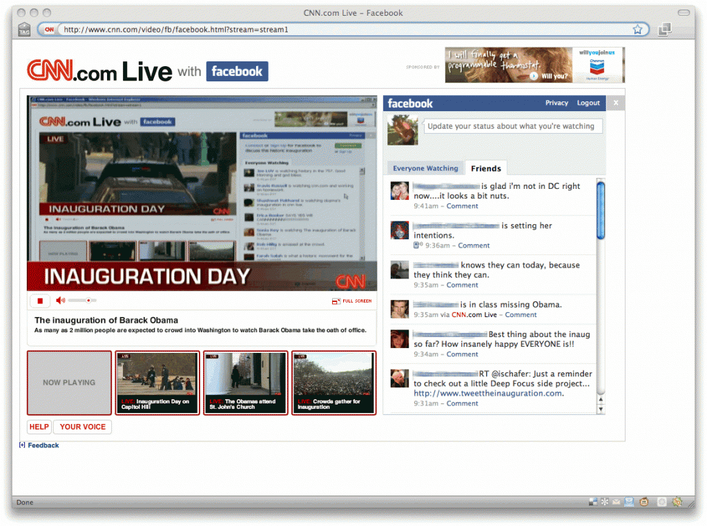
Using the API of other sites can add a lot of value to your own. CNN’s Facebook chat widget, which Facebook users can use to see their friends’ comments on live events, is a recent example of how you can leverage your users’ relationships with other sites to enhance your own. Likewise, in a recent study for Sony, we recommended using an open architecture to display 3rd party reviews (CNet, Amazon, etc.) on their product pages, in order to make comparison shopping and research easier and more credible.
In short, building garden walls around your website can theoretically make it more slick and seamless, but you can lose out a lot on functionality, and force people to learn new interaction models unnecessarily.
3: Building a lame lame lame social network
When users want to connect with other people online, they usually have a number of ways of doing this—email and instant messaging for private one-on-one or small-group correspondence, social networks for informal and semi-public messaging, and more recently Twitter for mass-blast communication. That’s a considerable amount for any average person to manage, and nobody, except for certain groups of bored young people, is fishing around for more social networks to join. In spite of their massive customer bases, Coca-Cola, GM, Verizon, and countless others have tried and failed to spread the social gospel about their products.
If there’s nothing reallyintrinsic to your website that would benefit from “community-building” features, don’t build them—instead, like we recommend in #2, you should take advantage of the platforms that people are already using, like Facebook and MySpace. Both offer enormous user bases, and installing an app is far less of an inconvenience than signing up for a site, creating a profile, calibrating the account settings, finding users to connect to, and returning to the site to see what’s new. (Sure enough: Verizon and Coke have both moved their efforts onto Facebook.)
One possible exception is the Nike+ social network for runners. Nike claims its efforts have given its running shoe sales a shot in the arm, a point which has been debated; at the very least, people do seem to use it. Why have they succeeded where others have failed? Possibly because of its partnership and product integration with Apple’s iPod, or its tandem efforts on both Facebook and MySpace, or its millions upon junkzillions of ad dollars. Who knows, really.
4: Not knowing when to ignore and when to listen
Obviously we’re huge proponents of user research, but there comes a time when you need to balance research against insight and innovation. Lots of inspiration can come from seeing how users interact with your designs, but if that research is too focused on error-finding and usability-tweaking, then you’re going to overlook the broader point about people’s motivations for using your product. You don’t design iPods just by studying how people use their Walkman. As Adaptive Path’s Todd Wilkens said in one controversial blog post, “There’s only so far you can get by streamlining the shopping cart on your website.”
And then there are the kinds of inventor’s insights that don’t stem from research at all: the discoverer of the structure of benzene claimed to have divined it from a dream; the inventor of Velcro came up with the idea after picking burrs off of his dog; and the insane story behind the invention of the telephone involves (picture this) Alexander Graham Bell massaging his Skye terrier’s throat, misinterpreting a thesis written in a language he couldn’t read, studying musical chords, and teaching the deaf.
Which is all to say that research is great and often necessary, but it’s still not everything.
5: Asking people what they think
What’s wrong with getting feedback? (We know, we’re a friggin’ user research company.) The ubiquity of market research has made user opinion gathering all but inevitable for the design of sites, and the result is an unhealthy over-reliance on getting user opinions to fix every problem. The fact is, users are often terrible at pointing out the usability flaws in an interface, and besides, the flaws they might uncover when they think about what’s wrong with the interface may be completely different than the ones they encounter when they’re using it. Malcolm Gladwell’s anecdotes about the Aeron Chair and spaghetti sauce (below) illustrate that what people say they want is often completely at odds with what they actually want: the Aeron chair’s strange looks made testers initially believe that it was uncomfortable, and people who were asked if they wanted more varieties of spaghetti sauce said “no”; their actual purchasing behavior suggested otherwise.
And then there’s the billions of surveys conducted by e-commerce companies, asking you what you think of their web site. How does it look? After seeing the site today, do you plan on coming more or less often? Scale of 1-10: how was your experience? Here’s a question: who fucking cares? How is this going to help you make the really big, interesting changes that will make your website a pleasure to use?
So this is where behavioral user research comes in. One of the main differences between market research and behavioral research is that the former deals with opinions and preferences, while the latter deals with behavior. If you’re trying to figure out what color people prefer for text links, or whether people like the way your new web design looks, go ahead and do a market research study to ask your users what they think, point-blank: focus groups, surveys, interviews, whatever. But if you’re trying to figure out where users are running into trouble, and why and how they use your site, then you don’t want to ask them—you want to observe them and hear them as they talk through their interaction with the site. One-on-one moderated research, by the way, is ideal for this kind of close qualitative research.
6: Missing the point about UX
UX is fundamentally about creating experiences that are designed for people, not for technology or large organizations. Visual appeal and back-end performance obviously play a big role in website visitors’ experiences, but it’s not the same as UX: good UX is a good functional experience.
No amount of Flash, AJAX, video content, social networking features, weirdad campaigning, “enhanced messaging”, better SEO, fewer ads, less description, more description, and/or more cowbell is going to improve a site’s user experience. Fancy landing pages that take a few seconds to load and don’t do anything except direct you to the real website aren’t effective. There’s a fallacious assumption that eye-catching and attention-grabbing elements somehow create a good user experience, but these are interactive websites we’re dealing with here, not products on a shelf.
Often, a company’s motivation for adding the eye-catching stuff is to “get a message across” about their product: Pepsi makes you sexy, Dell laptops reverse global warming. However, we’ve seen that users get enraged when they feel the information they’re looking for is obscured by marketing fluff and lifestyle branding.
Along the same lines, investing too much attention into the site’s technology at the expense of the interface can cripple its success. We’ve found that users are far more willing to grapple with a buggy, unstable interface that gives them the experience they want (Twitter much?) than a rock-solid piece of technology that offers nothing new (Bing much?).
Of course, there are times when really bad performance can sink even a company with no clear competitors (oh man, remember Friendster?).
7: Letting product marketing people run the show
Even if you do get the point about UX, large organizations are often structured to let the marketing people have the final say about what goes on the website. Marketing professionals are, first and foremost, responsible for developing insights about what makes people want to buy their products. They develop the brand, and they make sure the language is consistent with the brand; they position products, they focus on aesthetic consistency and attitude and messaging. Your average consumer company has separate teams in charge of marketing each one of their products or product lines, and are usually in charge of the language used to describe each product, and even the design of web pages for each product.
Again and again, we see organizations conducting good behavioral user research studies, and then handing the results over to the marketing people, who usually say: “Well, that’s nice, those are interesting findings—we’ll see how this fits into our marketing strategy.” And of course they say that—it’s not their job to build a good functional experience. The problem is that the people whose job it really is—interaction designers, UX researchers—usually have little say in the final design of the site.
Marketing-driven web design is a bad idea—we suspect it’s what causes mistakes #3, #5, and #8—and it’s also a misinterpretation of what it means to build a brand. If you are down with Marty Neumeier like we are, then you know that building amazing functional experiences is a much better branding strategy than six paragraphs of copy-approved marketing gibberish.
8: Holding the user’s hand
Users want websites to help them, not do things for them. Amazon is the queen of online retail, and its most successful features (the three-page checkout process, one-click purchase, similar items, editorial and user reviews) are the ones that make it much easier for the user to do what they came to do: find the right product, learn everything they can about it, and buy it.
What you don’t want to do is force your users to do things your way. A perfect example of this are those shopping assistant widgets that ask, “Which product is right for you?”, and then make you fill out a form or answer a series of question in order to have the system tell you what’s right for you. That approach is far too restrictive: it doesn’t allow users to see other options, or adjust their priorities in light of new info. It doesn’t offer context.
It’s important to offer core product details (price, main features, performance, comparison shopping info) up front, give your users direct and up-front links that help them learn more about the product, and then give them clear calls to action.
Heroku’s hot product selection widget hotness
One site we’ve seen recently that achieves all of these things to stunning effect is the Rails solutions vendor Heroku. A big, dynamically-updated total price right up top, including a breakdown of the pricing factors; a plain-as-day list of offerings, and a slider and single-click options you can use to select your purchases. You can browse customize, and select all of the items without leaving the page even once. Note to everyone: do it like this.
9: Making content that looks like advertising
The more people use the web, the more adept they become at screening out ads. Tower and banner ads have become all but invisible to goal-directed users, and things that seem “separate” from the body content of the site are often completely overlooked by users. The general idea is that people are seeing everything on your site in terms of how its relatedness to their main tasks (shopping for a product, finding information, etc.) and will tune everything else out.
Ironically, it’s often when you try to make something stand out in order to catch the user’s attention that it starts looking like advertising: site navigation bars, news and announcements, and featured products often get ignored for this very reason.
10.Forcing visitors to register to access basic information
Fortunately, this isn’t as common as it used to be—in a bid to gather info about its user base, some companies put basic information or content behind a registration wall. The New York Times infamously required registration for access to certain basic articles and features, a much-maligned move which spawned sites such as BugMeNot, allowing users to get around registering with real user info.
Requiring registration isn’t always a terrible idea, especially when you’re offering a premium service, or the content wouldn’t be relevant to most casual browsers. But you have to be careful which info you choose to lock down; often, casual info-seekers will abandon a site and look elsewhere for information than undertake the hassle of registering for yet another website.
Want to learn remote research? Bolt | Peters is hosting a one-day workshop on August 26th, and you’re invited. Give us a day and we can teach you all the rocket surgery you need to conduct qualitative studies the real-time, native environment way.
Date: Wednesday, August 26th, 2009 Time: 9am – 4:30pm. Sign-in starts at 8:30am, drinks and schmoozing afterwards Place: Bolt | Peters User Experience at 60 Rausch St., unit 102, San Francisco, CA More Info:http://escapethelab.com Cost: $399. Register now (space very limited). 1/2 off for students and underemployed. By:Bolt | Peters User Experience, the makers of Ethnio
Bolt | Peters Instructors
Cyd Harrell, Director of Research
Frances James, Lead UX Researcher
Nate Bolt, CEO
Who Should Attend?
Researchers, designers, and product managers who want to watch real people use technology from the comfort of their own desks. (While saving travel costs and the planet!)
What We’ll Cover
Strengths and weaknesses of remote ux research
Study design & scripting
Participant recruiting options
Moderating in the remote environment
Tools for screen sharing, recording, and communication
What can go wrong and what to do about it
What You’ll Take Home
A Trapper Keeper full of script outlines, consent forms, and software comparisons
I think it’s a badge of honor for web consulting companies to not update their public sites sometimes. It says “hey we’re busy working on your problems, we don’t have time to work on our own.” That’s certainly been the case with boltpeters.com for the last seven years; with some new home pages and design tweaks, it’s basically been the same hand-coded HTML that we put together in 2002. Well, finally, we’ve updated the site. Hope you like it. Definitely drop a line to let us know if it offends every fiber in your body, or otherwise.
This year at SXSW we used a unique handout to engage the audience:
If you look closely you can see that everyone is voicing either their displeasure or pleasure using this artfully hand crafted handout created by me, Julie Melton, and Mark Trammell :
Hear that? It’s the sound of the glass ceiling shattering into a million pieces—because now, for the first time in HERhisstory, Dell has made their computers accessible not only to men, but to female people!
Dell has launched a new site for female laptop buyers, Della, which shows you how to use your computer to “track your food intake”, “find recipes online”, and “watch yoga videos”. (Note how the computers match their owners’ clothes: because we all need a $1200 accessory. Also note “cherrydoll”‘s authentically mispunctuated comment: because syntax is for boys!)
Above is a picture of me, yes, a woman, with the last Dell I will ever own. It’s my current laptop, and I chose it because I needed a computer powerful enough to run screensharing tools and high-res video; I needed mobile broadband to stay in touch with my clients and employees, and not just my kid (heresy!); I needed my screen to look great when I go to meetings with clients.
That is to say, I needed it for work.
Dell, let’s make it official: you can bite me and the millions of other women who take themselves and their technology seriously. This makes me sad, because I used to like Dell.
Here’s what I’m guessing happened: you did the wrong kind of research. You relied on surveys that genericized women’s desires as consumers. You asked lifestyle questions instead of focusing on people’s real-life behaviors. You knew that some women find technology intimidating (newsflash: so do some men), so you set out to transform the laptop into a lifestyle product. You handed that brief to your designers, and then—assuming you tested this on any actual users at all—you asked them if they “liked” it or if it made them feel comfortable.
Well, guess what? You missed the entire point. Just making your site easier to understand and navigate would benefit all your users, male and female, and wouldn’t be that hard to do. But by making it a gender issue, you gave yourselves permission to avoid the challenges of explaining new technology in plain English, and you just stuck on a fluffy front end to mollify dumb girls. I haven’t been so disgusted with a tech company in a long, long time. It seems lots of other people are talking about it and they aren’t too happy.
Writers cling hard to the word, to semantics, to meaning and sensibility. Design, by contrast, is less verbal. Design is busily inventing new ways to blow itself apart. Design is taking more risks with itself than literature. That is why contemporary design feels almost up to date, while literature feels archaic and besieged.
Design and literature don’t talk together much, but design has more to offer literature at the moment than literature can offer to design. Design seeks out ways to jump over its own conceptual walls-scenarios, user observation, brainstorming, rapid prototyping, critical design, speculative design.
My feeling is that most of what Sterling identifies as literature’s constraints—magazine word counts, typing apparatuses, readership and so on—speaks mostly to practices of publishing and disseminating fiction rather than creating and understanding it. He also speaks of language’s limitations as if they were a bad thing: in her excellent book Hamlet on the Holodeck, Janet Murray makes the point that reading (as well as interaction) is as much about the reader’s “active creation of belief” as it is about the “suspension of disbelief”. In other words, the sensory and spatial completeness that writing lacks is supposed to be supplied by the reader, which makes reading an inherently challenging cognitive task.
Sterling aptly quotes the designer Charles Eames: “Design is a method of action. Literature is a method of meaning and feeling.” I more or less agree with this, but Sterling goes on to hazily suggest that the projects of design and literature (or at least science fiction) are fatally limited, and need to be scrapped in favor of some “new, more general, creative project”. Wuh? You mean like books about Twitter written in Powerpoint? Instead of thumb-twiddling about the inability of literature and design to “synthesize” and somehow anticipate the “new century’s grander narrative”, how about we just stick to the only methods that have ever improved design and fiction with any certainty: research, revision, iteration, and the occasional encounter with genius?
Next week, our own Nate Bolt will be battling with UX luminaries Mark Trammell, Peter Merholz, and Jared Spool, on a panel discussion about “When UX Research is Evil”.
Blurb:
Usually when you design and conduct a user research study, you’re focused on keeping the methods sound, recruiting good users, and asking the right questions, which is already a tall order. Unfortunately, no matter how well you conduct your studies, your methods have little to do with how the research ultimately gets used. Everyone’s a little bit to blame for this: researchers can do evil by conducting useless research and presenting it ineffectively; clients can do evil by misconstruing findings, or by undervaluing research to begin with.
This talk will cover the ways that research can be misconducted, misinterpreted, and misunderstood, and on the other hand, how you can involve your clients in your research, to show them how and why it’s done, and get inspired to think about design problems through the eyes of real users. NOW EXTRA SPICY! This panel promises to a knock-down, drag-out, battle to the last! Not for the squeamish or the faint of heart.
Congratulations. You may have just clicked on our first-ever (maybe the first ever) UX poem. What do you think? I guess I’m outing myself as a poet too. Hi! The BP homepage was a challenge from Nate to write about our work, hopefully the first of many.
By the way, you can see more of my non-UX-related work at http://www.cydharrell.com if you’re interested. And if you’ve never seen the Joyce Kilmer poem on which this is based, it’s here.
—–
UX Poem
I think that I shall never see
a website lovely as a tree
diagram—
a diagram that in its lines
elucidates the way one finds
most any leaf; assuming though
that “one” is not just anyone
(not me, not you—some more abstract
persona that we all can act
as, as we drive agreement
on the structure and IA,
with proper reference to requirements
and use cases of course.)
But I’m pretty sure I’ll never see
a user navigate a tree
like a cat or a persona.
All those things in the forest
between us and home?
They’re big blurs of green to fools like me
not made by god for climbing trees.
Marty Neumeier gave a pretty awesome talk today at Adaptive Path’s MX Conference based on his book, The Designful Company. His intro was engaging right off the bat, so like any talk I think is about to be inspiring, I started taking lots of notes. This is them, and please offer corrections or feedback if I’ve screwed something up.
Why Did I Write This Book?
Not to get great reviews. Because right off the bat I got some pretty harsh reviews. Within the first day, people on Amazon had called it “atrocious” and lots of other things that were less than flattering. But that’s okay because I wrote this book because designers need to be at the business table.
When Innovation was Born in Corporate America
On the same day three (four?) years ago, the Wall Street Journal had two headlines “US Economy loses steam” and “Apple profits increase sixfold.” Wow, that’s quite a different pair of headlines. Marty says that was the day design innovation was born in corporate America. When the journalists asked steve jobs how the hell he could keep that breakneck pace up, he said “we intend to keep innovating.” Awesome quite.
Who is a designer?
A designer is anyone who devises ways to change existing situations into preferred ones.
The dragon gap
The space between vision and reality. Between what is and what could be. That gap is where the dragons are. Standard case study thinking does not promote innovation because it’s all about avoiding risk. The designing mindset is different. You get more bang with design. Until the late 90’s office chairs all looked the same until herman miller came along with the aeron chair. At one point it made 30% of all their profits, even though they sell these crazy cubicle systems.
Wicked problem survey
Neutron and Stanford surveyed 1500 CEO’s on their top wicked problems. #1 was balancing long term success with short-term demands. Even though business has been design-blind, the public has not. Famous business person asked the architect of the Eiffel tower “it’s nice but where’s the money in it?” and a true designer would have said “it’s an inspiring symbol of French progress, and nobody will ever forget their trip to paris.” (Nate says: There was something i missed here about “Generate wide-spread wealth”)
How Do We Accomplish All This?
How can we build products or services that out-last the CEO? How do you embed design thinking? How can we transform our business into a culture of non-stop innovation?
Answers
1. Start with a bold vision. “Who wants a dream that’s near-fetched?” Howard Shultz
2. Choose your co-conspirators. Align yourself with people who are screaming for change now
3. Design the way forward (back of the napkin book)
4. Empower your company
How do you avoid bold dumb vision? (brandon’s question)
Ford had the bold vision of a ford pinto. They made the mistake of deciding their design vision instead of designing it. That’s what happened with the aeron chair. They wanted to make the best chair ever, and they threw out the style guide of all previous office chairs to do that. They made a prototype and tried it with potential customers, and they said “it’s sort of comfortable but it’s kind of weird. I don’t know if I would buy it.” Then they worked really hard on the comfort part of it, and then eventually people said “it’s really very weird but it’s super comfortable.” Then it takes off because it is different. I worry about innovation that aren’t different enough, and the pinto was maybe too different. Clairol “touch of yogurt” shampoo was going too far. You learn to spot a real innovation by it’s combination of being weird and good. That’s where the real art comes in, doesn’t it? Knowing the difference. You protect against horrible innovation by prototyping. Test this out little by little. Either in the market or wherever. Stage-gate innovation is what we call it. Ventures do that by giving a little money, then a little more money. Businesses want to get into the market immediately, and they are impatient. So they take very small risks. That’s just me-too-ism. Anyone who can help prototype. Herman miller said “we’ve gone this far, let’s go one step further and keep trying it in the market place.
How do you convince a CEO that they are a designer?
Aesthetics of management. Changethis.com. Comparing various art forms to the way management runs business. Contrast, rythym, and things like that you use in art, you can also use in business.
It’s all about “Creating possible futures” that you then sell up.
We dedicate this edition of our newsletter to the upcoming inauguration of Barack Obama. Our own Kate Nartker commemorates the occasion with a felt Obama logo:
Just a reminder: in addition to publishing cute newsletters, we also do kick-ass UX work that settles arguments, gets design priorities straight, dramatically increases conversion, and gives you an excuse to eat popcorn and Junior Mints in the office while watching sessions. You should totally call us.
No time or budget to put on a full-scale user research project in this crap-fiesta of an economic downturn? No problem! We can intercept real-life customers, cut through the bullsh*t, and help with concrete design changes based on behavioral research – all in a casual, one-day study.with serious results.
Thanks to your votes, our panel was picked! Nate‘s on it, so go to SXSW this year and heckle him. There should be quite a lively debate with Mark Trammell from Digg, Andy Budd from Clearleft, Juliette Melton from Lumos Labs, and Carla Borsoi from Ask.com.
If you’re curious about how B|P applied our user experience focus and HCI principles to the Spore player research project, then our upcoming article inBoxes and Arrows will be for you—watch for it early next week.
That’s right: we said it. Bolt | Peters biz is down by about 30% from this time last year, and setting projects up is taking about three times as long. Now, since we showed you ours, will you show us yours? Take our anonymous mini-survey, ‘cuz we’re all dying to get a better idea of just what the state of the tech industry is like lately. If you just want to cheat and see what everybody else is saying, you can do that, but deep down in your heart you’ll know you peeked.
If you’ll be around San Francisco on Thursday, February 26th, mark your calendar for our seven-year birthday party! Dig the invite on Upcoming orFacebook. There will be a full(-ish) bar, tasty snacks, and a local soul/jazz quartet fronted by the illmatic Joe Bagale.
Holy moly! We were floored by the amount of enthusiasm for URF 2008. Nearly 200 people joined us at the Mighty Gallery & Bar in San Francisco to enjoy drinks, bacon-flavored chocolates, and a stellar line-up of speakers. The audience twittered, took pictures, shmoozed, and generally had a great time —Cooper Journal and Core77 wrote up their experiences. It was such a success that we’re planning an ’09 edition, as well as possibly another one in Portland. If you have a great suggestion for a topic or presenter, email us!
Finally, everybody can stop chattering at parties about the lack of deep, knowledgeable books about remote research methods. What, that’s never happened to you? Well, we’re writing one anyway. Rosenfeld Media has signed Nate & Tony (not pictured below, we swear) to co-author the book, which is due out in late 2009. Check the Rosenfeld site for more info.
It’s been four years since we started Ethnio as the world’s first remote user research tool, and it’s been awesome to get all of the support and usage from everyone. Thanks! This is a friendly heads up that we’ll start charging for Ethnio on February 1st., 2009. It’s an unsurprising combination of the financial apocalypse and usage increasing to millions of views, hundreds of thousands of recruits, and more server load than we can really handle for free. You might have a few questions about the details, which are covered below in neat little sections.
Pricing Details
Here are the three basic packages starting in February. By default, you’ll remain in the free package until you need to recruit more than 20 people for your research using ethnio. The site has not been updated so this email is just early warning for your convenience and planning.
* 20 Recruits
Free
* 200 Recruits
$400
* 2,000 Recruits
$800
Umm, What is a Recruit?
Anybody that answers all of your screener questions counts as one recruit. So essentially every response to an ethnio screener is a recruit, but we have some clever ways of only charging for people that are qualified research candidiates. The same kind you would pay a recruiting agency $100 a head for! The first way is that ethnio automatically marks any response with more than 3 blank fields as “bogus.” The second is that any recruits through your preview are not counted, so you can test away. The best is that you can manually mark any response as “bogus” so that it won’t count towards your monthly total. That is on the honor system, yo. We trust you to not mark all your recruits as bogus but our interns will check just in case. Login to ethnio, Go to the Recruits tab, and check out the Status column to try it out.
Can I Still Login for Free?
Yep. Your current ethnio login will continue to work until the end of time, so don’t worry about losing access to any recruits or screeners you have completed in the past. The new system will always let you login and create screeners, but will only let you receive 20 recruits for free per month. After that, it will ask you to upgrade. While you are using ethnio for free, we do ask that you take down the activation code if you are on a big ol’ web site (20,000+ uniques / day).
This is Way Too Expensive You Suck
Well that’s not really a question, but you can always purchase recruits for one study and not pay anything until you need another study. Like with flickr or vimeo but way more pricey and geared towards us qualitative researchers out there.
Remember June 2000? Over in Silicon Valley, there seemed to be a sort of nervous-but-not-panicked vibe in the air: “Everyone else’s company is going to hell, but we seem to be doing alright.” Then the internet bubble burst and everyone shed fat tears of milk!
So now it’s December 2008, and in our experience, people seem to be saying the same things: “Things are sucky, but we’re okay.” We were wondering just how true that was, so we made this quick, three-question quiz to find out! Take it and see for yourself!