Building a consumer website is tough, because there are so many competing demands: design, marketing, implementation and operations—the list goes on. It’s all a ridiculous mess, and so it’s easy to forget that it all boils down to the human beings who will actually be the ones buying things on your site. Here are ten mistakes we’ve noticed dozens of companies (not to mention a handful of clients) make time and again with their websites:
1: Designing your site navigation to match internal corporate structure
The way your company thinks of its products / services / offerings is almost never the same as the way the user thinks of them, for the simple reason that your perspectives are different: you’re making, they’re using. That means sorting your navigation into categories by using distinctions that users would never make themselves. I mean, check out this nonsense:

So how do you figure out what structure works best for users? Start out with a card sorting study. There are lots of tools like OptimalSort and WebSort you can use to conduct this research online, and both provide analysis features that help you determine what the best organization is. (For the whole story about how to design and conduct a card sort, check out Donna Spencer’s Card Sorting.)
2: Not playing nice with other online services
Designing and managing every part of your own website sounds like a professional way of doing things, because you get complete control over the look and feel and the branding; even from a UX perspective, it can seem more consistent. However, people are starting to associate certain online tasks with established interaction models: Google for search, email and Facebook for online contacts, AIM and GChat for instant messaging, and so on.
We’ve worked with a handful of clients who wanted to close off their content to Google in order to force users to use their own internal search, and that’s just silly—not only would you strangle off a major traffic source, you’re restricting users to an experience that they may be less comfortable with.
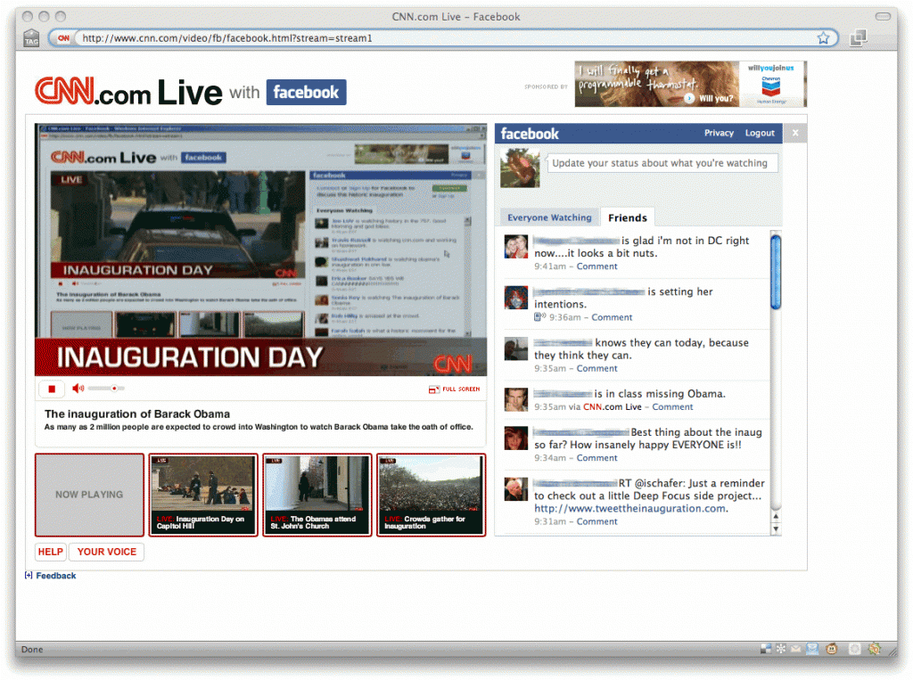
Using the API of other sites can add a lot of value to your own. CNN’s Facebook chat widget, which Facebook users can use to see their friends’ comments on live events, is a recent example of how you can leverage your users’ relationships with other sites to enhance your own. Likewise, in a recent study for Sony, we recommended using an open architecture to display 3rd party reviews (CNet, Amazon, etc.) on their product pages, in order to make comparison shopping and research easier and more credible.
In short, building garden walls around your website can theoretically make it more slick and seamless, but you can lose out a lot on functionality, and force people to learn new interaction models unnecessarily.
3: Building a lame lame lame social network

When users want to connect with other people online, they usually have a number of ways of doing this—email and instant messaging for private one-on-one or small-group correspondence, social networks for informal and semi-public messaging, and more recently Twitter for mass-blast communication. That’s a considerable amount for any average person to manage, and nobody, except for certain groups of bored young people, is fishing around for more social networks to join. In spite of their massive customer bases, Coca-Cola, GM, Verizon, and countless others have tried and failed to spread the social gospel about their products.

If there’s nothing really intrinsic to your website that would benefit from “community-building” features, don’t build them—instead, like we recommend in #2, you should take advantage of the platforms that people are already using, like Facebook and MySpace. Both offer enormous user bases, and installing an app is far less of an inconvenience than signing up for a site, creating a profile, calibrating the account settings, finding users to connect to, and returning to the site to see what’s new. (Sure enough: Verizon and Coke have both moved their efforts onto Facebook.)
One possible exception is the Nike+ social network for runners. Nike claims its efforts have given its running shoe sales a shot in the arm, a point which has been debated; at the very least, people do seem to use it. Why have they succeeded where others have failed? Possibly because of its partnership and product integration with Apple’s iPod, or its tandem efforts on both Facebook and MySpace, or its millions upon junkzillions of ad dollars. Who knows, really.
4: Not knowing when to ignore and when to listen
Obviously we’re huge proponents of user research, but there comes a time when you need to balance research against insight and innovation. Lots of inspiration can come from seeing how users interact with your designs, but if that research is too focused on error-finding and usability-tweaking, then you’re going to overlook the broader point about people’s motivations for using your product. You don’t design iPods just by studying how people use their Walkman. As Adaptive Path’s Todd Wilkens said in one controversial blog post, “There’s only so far you can get by streamlining the shopping cart on your website.”
And then there are the kinds of inventor’s insights that don’t stem from research at all: the discoverer of the structure of benzene claimed to have divined it from a dream; the inventor of Velcro came up with the idea after picking burrs off of his dog; and the insane story behind the invention of the telephone involves (picture this) Alexander Graham Bell massaging his Skye terrier’s throat, misinterpreting a thesis written in a language he couldn’t read, studying musical chords, and teaching the deaf.
Which is all to say that research is great and often necessary, but it’s still not everything.
5: Asking people what they think
What’s wrong with getting feedback? (We know, we’re a friggin’ user research company.) The ubiquity of market research has made user opinion gathering all but inevitable for the design of sites, and the result is an unhealthy over-reliance on getting user opinions to fix every problem. The fact is, users are often terrible at pointing out the usability flaws in an interface, and besides, the flaws they might uncover when they think about what’s wrong with the interface may be completely different than the ones they encounter when they’re using it. Malcolm Gladwell’s anecdotes about the Aeron Chair and spaghetti sauce (below) illustrate that what people say they want is often completely at odds with what they actually want: the Aeron chair’s strange looks made testers initially believe that it was uncomfortable, and people who were asked if they wanted more varieties of spaghetti sauce said “no”; their actual purchasing behavior suggested otherwise.
And then there’s the billions of surveys conducted by e-commerce companies, asking you what you think of their web site. How does it look? After seeing the site today, do you plan on coming more or less often? Scale of 1-10: how was your experience? Here’s a question: who fucking cares? How is this going to help you make the really big, interesting changes that will make your website a pleasure to use?
So this is where behavioral user research comes in. One of the main differences between market research and behavioral research is that the former deals with opinions and preferences, while the latter deals with behavior. If you’re trying to figure out what color people prefer for text links, or whether people like the way your new web design looks, go ahead and do a market research study to ask your users what they think, point-blank: focus groups, surveys, interviews, whatever. But if you’re trying to figure out where users are running into trouble, and why and how they use your site, then you don’t want to ask them—you want to observe them and hear them as they talk through their interaction with the site. One-on-one moderated research, by the way, is ideal for this kind of close qualitative research.
6: Missing the point about UX
UX is fundamentally about creating experiences that are designed for people, not for technology or large organizations. Visual appeal and back-end performance obviously play a big role in website visitors’ experiences, but it’s not the same as UX: good UX is a good functional experience.
No amount of Flash, AJAX, video content, social networking features, weird ad campaigning, “enhanced messaging”, better SEO, fewer ads, less description, more description, and/or more cowbell is going to improve a site’s user experience. Fancy landing pages that take a few seconds to load and don’t do anything except direct you to the real website aren’t effective. There’s a fallacious assumption that eye-catching and attention-grabbing elements somehow create a good user experience, but these are interactive websites we’re dealing with here, not products on a shelf.
Often, a company’s motivation for adding the eye-catching stuff is to “get a message across” about their product: Pepsi makes you sexy, Dell laptops reverse global warming. However, we’ve seen that users get enraged when they feel the information they’re looking for is obscured by marketing fluff and lifestyle branding.
Along the same lines, investing too much attention into the site’s technology at the expense of the interface can cripple its success. We’ve found that users are far more willing to grapple with a buggy, unstable interface that gives them the experience they want (Twitter much?) than a rock-solid piece of technology that offers nothing new (Bing much?).
Of course, there are times when really bad performance can sink even a company with no clear competitors (oh man, remember Friendster?).
7: Letting product marketing people run the show
Even if you do get the point about UX, large organizations are often structured to let the marketing people have the final say about what goes on the website. Marketing professionals are, first and foremost, responsible for developing insights about what makes people want to buy their products. They develop the brand, and they make sure the language is consistent with the brand; they position products, they focus on aesthetic consistency and attitude and messaging. Your average consumer company has separate teams in charge of marketing each one of their products or product lines, and are usually in charge of the language used to describe each product, and even the design of web pages for each product.
Again and again, we see organizations conducting good behavioral user research studies, and then handing the results over to the marketing people, who usually say: “Well, that’s nice, those are interesting findings—we’ll see how this fits into our marketing strategy.” And of course they say that—it’s not their job to build a good functional experience. The problem is that the people whose job it really is—interaction designers, UX researchers—usually have little say in the final design of the site.
Marketing-driven web design is a bad idea—we suspect it’s what causes mistakes #3, #5, and #8—and it’s also a misinterpretation of what it means to build a brand. If you are down with Marty Neumeier like we are, then you know that building amazing functional experiences is a much better branding strategy than six paragraphs of copy-approved marketing gibberish.
8: Holding the user’s hand
Users want websites to help them, not do things for them. Amazon is the queen of online retail, and its most successful features (the three-page checkout process, one-click purchase, similar items, editorial and user reviews) are the ones that make it much easier for the user to do what they came to do: find the right product, learn everything they can about it, and buy it.

What you don’t want to do is force your users to do things your way. A perfect example of this are those shopping assistant widgets that ask, “Which product is right for you?”, and then make you fill out a form or answer a series of question in order to have the system tell you what’s right for you. That approach is far too restrictive: it doesn’t allow users to see other options, or adjust their priorities in light of new info. It doesn’t offer context.
It’s important to offer core product details (price, main features, performance, comparison shopping info) up front, give your users direct and up-front links that help them learn more about the product, and then give them clear calls to action.

- Heroku’s hot product selection widget hotness
One site we’ve seen recently that achieves all of these things to stunning effect is the Rails solutions vendor Heroku. A big, dynamically-updated total price right up top, including a breakdown of the pricing factors; a plain-as-day list of offerings, and a slider and single-click options you can use to select your purchases. You can browse customize, and select all of the items without leaving the page even once. Note to everyone: do it like this.
9: Making content that looks like advertising

The more people use the web, the more adept they become at screening out ads. Tower and banner ads have become all but invisible to goal-directed users, and things that seem “separate” from the body content of the site are often completely overlooked by users. The general idea is that people are seeing everything on your site in terms of how its relatedness to their main tasks (shopping for a product, finding information, etc.) and will tune everything else out.
Ironically, it’s often when you try to make something stand out in order to catch the user’s attention that it starts looking like advertising: site navigation bars, news and announcements, and featured products often get ignored for this very reason.
10.Forcing visitors to register to access basic information

Fortunately, this isn’t as common as it used to be—in a bid to gather info about its user base, some companies put basic information or content behind a registration wall. The New York Times infamously required registration for access to certain basic articles and features, a much-maligned move which spawned sites such as BugMeNot, allowing users to get around registering with real user info.
Requiring registration isn’t always a terrible idea, especially when you’re offering a premium service, or the content wouldn’t be relevant to most casual browsers. But you have to be careful which info you choose to lock down; often, casual info-seekers will abandon a site and look elsewhere for information than undertake the hassle of registering for yet another website.
573 replies on “Top Ten UX Mistakes on Consumer Websites”
[…] Ten UX Mistakes on Consumer Websites » Bolt | Peters 27.08.2009 — ubercom Top Ten UX Mistakes on Consumer Websites » – […]
Thank you for a useful and enlightening article. Some of it I knew in the back of my mind, but it hadn’t connected until your article. A challenge for the business owner is finding someone who can help design a website, so it meets your suggestions, the money to pay them adequately, and the time to do it. Our focus needs to be on our business – and there is enough to do in our everyday experience. Your article brings the value of such a person to the forefront. – Cat
[…] Read The Blog Post » […]
@Cat: Glad you liked it! We know it’s always easy to forget the common sense stuff when you’re focused on just trying to make something that works.
#10 is so true. I often abandon the site forever when I realize registration is required.
Here here!! Bravo.
[…] http://boltpeters.com/blog/ten-ux-mistakes/ […]
[…] by Nate Bolt […]
[…] Top Ten UX Mistakes on Consumer Websites (Bolt | Peters) […]
[…] Top ten UX Mistakes http://boltpeters.com/blog/ten-ux-mistakes/ […]