A few weeks ago, for a study of digital readers in university settings, our client had neither a highly trafficked website nor a large recruiting budget. No problem, we said, we can use Ethnio via Twitter. Normally this method is a great supplement to placing Ethnio code on a website, but for a student audience we were confident we could recruit the whole sample that way. It actually worked. We picked people out of the middle of the internet based on words they used in their conversations or profiles on Twitter. Here’s how it went and what we learned:
Category: Research innovation
A Native Language Approach
It’s becoming increasingly common to want to talk to users of technologies in other countries other than your own. Often times, this means communicating with people who are not native speakers of your language. This can be a very challenging aspect to a project, especially when it comes to recruiting, and it is something that we at Bolt | Peters have had to deal with a number of times. During a recent study of Japanese early adopters, we noticed a very interesting thing – When we tried recruiting Japanese participants over the phone, voicemails in english yielded a 0% response rate. Upon having a Japanese speaker leave the exact same message to the same potential recruits, we received a 50% response rate. The interviews were still in English.
It is critical that you, as a researcher, make the recruiting process as familiar to these international participants as possible. Even if they do speak your native language, they may not be strong speakers of it, and subsequently will feel embarrassed or nervous that they might not understand everything that is initially trying to be conveyed. This will make people not want to participate in the study, and that’s just bad news for everyone involved. Once they are more comfortable and settled into the study, it is much easier to continue doing the study in your native language.
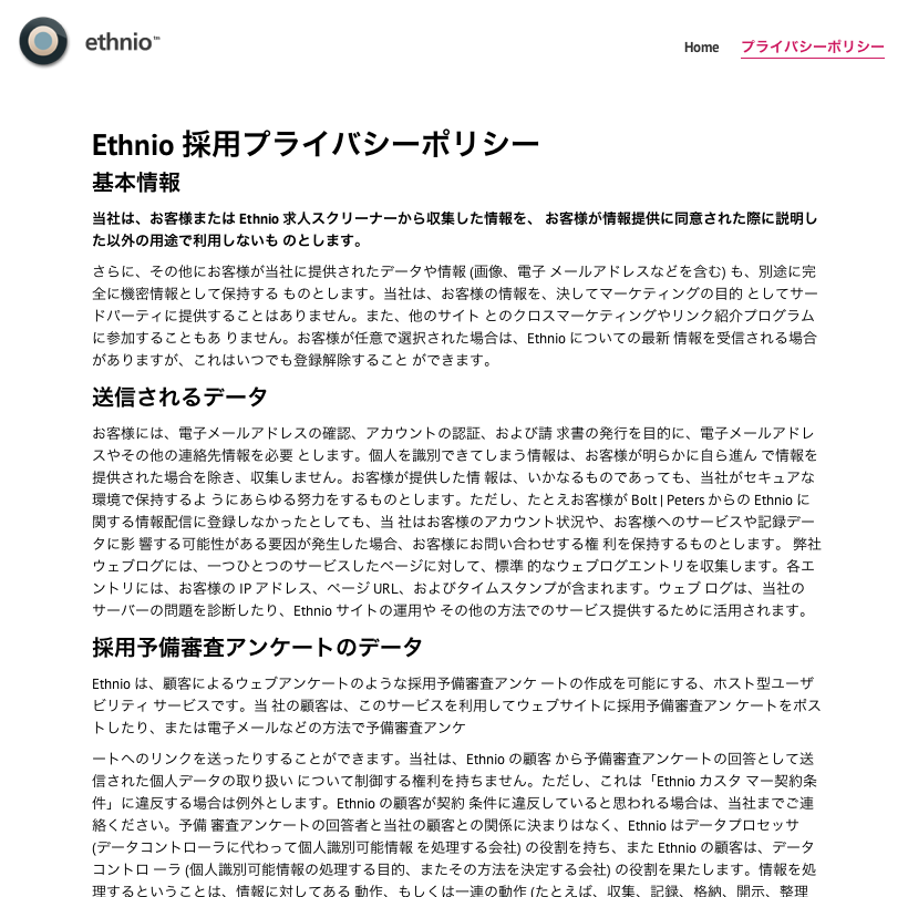
What we did to improve response rates was translate a number of the services that we normally use into Japanese. Below is an example of the Ethnio privacy policy translated into Japanese.
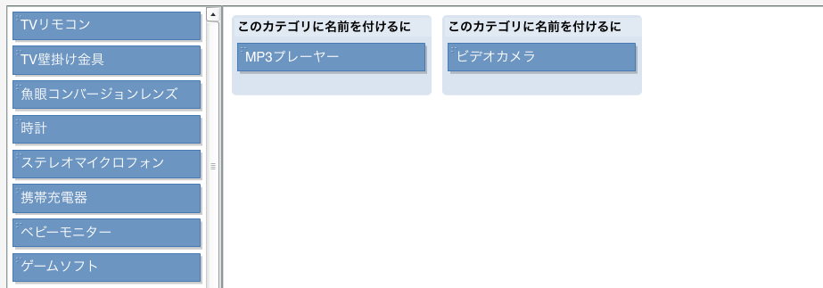
And recruiting isn’t the only place where translation is helpful. Consider card sorts and other forms of unmoderated research. If there isn’t an English speaker there to guide the participant, the participant may get confused and abandon the task halfway. It’s super easy to get services like OptimalSort and Usabilla translated into other languages. You can contact the makers of these tools and inquire how you can help translate them into other languages, and they will usually provide you with a spreadsheet of some sort that contains all the text that needs to be translated. For a fairly cheap price, you can get all of the information in those translated by an agency, and voila – you’ve just contributed to making UX a more global practice. Here’s what OptimalSort looks like in Japanese.
Have you had any experiences trying to conduct UX research in other countries using the native language of the population you are recruiting from? Let us know, we’d love to hear how you do global research.
The guys over at ZDNet who cover all things Mac-related have written up a quick summary of our recent comparison of mobile interaction with the Square payment system between the iPad and iPhone. Cool to see this article get so many comments and shout-outs. Both links below:
1. The ZDNet article about our article
2. The UX Magazine article we wrote
3. A Weekly subscription to ridiculous sun glasses.
That last one is really only included as proof that this blog has sort of been eclipsed by our use of Twitter. I mean we use this so much less now. Kind of crazy. I never would have thought this, but maybe we’ll just replace this with a nice-looking summary of all our tweets.
[Guest author: Rolf Molich owns and manages DialogDesign, a small Danish usability consultancy that he founded in 1993. Rolf conceived and coordinated the Comparative Usability Evaluation studies CUE-1 through CUE-8 in which almost 100 professional usability teams tested or reviewed the same applications.]
Usertesting.com – A usable and useful recruiting service
Usertesting.com offers unattended, 15-minute usability test sessions at reasonable prices with participants from the US, Canada and the United Kingdom. I have some experience with their service. I am pleased with it, but you should be aware that they really excel at recruiting users from the most broad demographics to spend time looking at your site, not usability analysis.

“Use it and your site will get better”
On their home page, Usertesting.com quotes Evan Williams, Twitter Co-founder: “Use it and your site will get better”. I respectfully disagree. Usertesting.com is a great recruiting service, but a skilled usability professional is still required watch the videos and extract useful usability recommendations. The opinions from the participants are mostly worthless. Participants’ behavior, not their opinions is important.
I used Usertesting.com in a recent comparative usability measurement study of Budget.com. Usertesting.com ran about 30 sessions for me with about 20 users. Since my five car rental tasks on Budget.com took about 25 minutes to complete, I had to split the tasks into two sessions and ask their customer service to get the same test participants to do two sessions with different tasks. This worked like a breeze, but it took me some extra time to handle and write instructions for two sessions.
19$, 29$, 39$, and counting?
At the time of my study in April 2009, Usertesting.com was charging just 19$ per test participant. Shortly after, they raised the price to 29$ per test participant. Now they have announced yet another price increase to 39$ per test participant. At 19$ per participant their price/performance ratio was amazing. At 29$ it was good. At 39$ I am not so sure, considering that you only get 15 minutes test time. At 4 x 39$ = 156$ per hour their service is less competitive compared to traditional recruiting. Despite their price increases, they still pay their participants 10$ per session.
High quality
Amazing turnaround time. In late December 2009 I used Usertesting.com to run three test sesssions of the Enterprise.com car rental service. The test sessions were completed within one hour from the time I submitted the request. Because of the time difference between the US and Denmark where I live, I sometimes submit requests at 4 am East Coast time, but even these requests are honored almost instantly.
Their test participants are great. So Usertesting.com’s screening process seems to work. One or two participants out of 25 were rather talkative and offered 10 minutes of worthless personal opinions about the website in addition to their helpful task solutions. Fortunately, this happened rarely and I simply filtered out the opinions and looked at actual behavior.
Video and sound from their recordings is good. I never had a problem understanding what a participant was saying or doing. See the sample screen from a recording below. In contrast, I’ve had professional usability consultancies who without blushing sent me usability test recordings where the video was blurred or the sound was a loud humming.
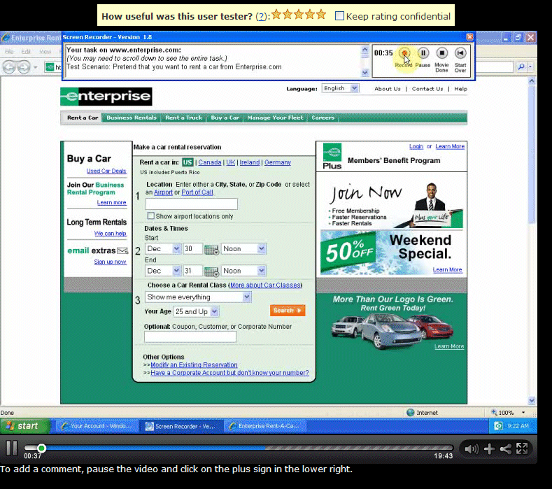
Their customer service is excellent. I got a fast and sensible response each time I asked them a question or submitted a comment.
Their customer service told me that their agreements with participants allow the clients any use of the recordings they want – including public presentation of the videos. This seems ethically defensible because you can’t see participants’ faces and you mostly don’t get their names.
A few limitations and caveats
For unattended test sessions where no moderator is available to correct misunderstandings on the spot, you may want to test your instructions to test particpants carefully. You must provide your own pre-session interview questions and the all-important debriefing questions.
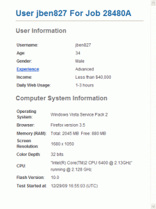
Usertesting.com only provides rudimentary demographic information about participants as shown in the screenshot below. If you want information about approximately where participants live, what their profession is and if they’ve used the site or similar sites before, you must use precious test time to ask in your test instructions.
Usertesting.com’s setup allows the participant to interrupt the recording at any time. This may be OK for qualitative testing, but it spoiled a few of my task time measurements. Also, in a few cases test participants seemingly left the session for about 5 minutes without explanation – no sound and nothing moved on the video. In one case it seemed to me that a test participant had rehearsed the test questions before they clicked the recording button and started the real session. I must add, though, that if I expressed just the slightest bit of dissatisfaction with a participant, their customer service immediately refunded me what I had paid. Of course moderated sessions aren’t perfect either – and most often they don’t have a money back guarantee.
Some of my colleagues have argued that Usertesting.com offers “professional” test participants. It is true that on 2-3 occasions test participants inadvertently showed me their test session dashboard which showed that they had been doing about 10 test sessions recently. Personally, I don’t mind this. I have yet to see a participant who was so experienced in user testing that it prevented me from getting the data I wanted.
All in all: Recommended
Usertesting.com has a great concept and implements it with care. Before their recent price increase, I would even have said “Highly recommended”.
Resoures
The comparative study of Budget.com that I used usertesting.com to test (CUE-8).
Ford’s UX Research

The new 2010 Ford Fusion, presented today at CES, has a heavy focus on in-car technology—SmartGauge fuel consumption meters, in-car wifi and touchscreen apps, voice-activated Sync technology, and iPod controls all introduce a huge amount of user interaction. As twitterer @zsazsa says:
“What impresses me most about Ford keynote isn’t their tech, but the huge amount of user research they’ve done and acted on.”
Clearly this is a huge user research task, and IDEO was called in to do design and research. As the Movement Design Bureau comments, the research project sounds pretty far-ranging:
The Smartgauge team worked closely not only with designers and engineers within Ford, but with the most famous user-design/research guys of them all – IDEO, and conducted extensive, ethnographic research – not only with hybrid drivers, but with those who drove hummers, bicycles, and even professional athletes and their trainers.
We’ve done some in-car ethnography ourselves, and we think it’s a fascinating area for innovative research—the inside of a car is an environment with a totally unique set of design constraints and user needs, and it’s a place where (for better or worse) Americans spend hours every day. We’re curious what the professional athletes were doing in that study, but word up to Ford and IDEO for working to understand how people use technology in their cars.
How B|P Researched Spore
So we’ve been beating around the bush for the past year or so about this top secret game research project of ours, and now that the game has finally hit the streets, we’re bringing the news to you in all its full glory. How did we test the game? Who did we talk to? Do we have lots and lots of video to back it up? Let’s start from the beginning.
[vimeo] http://vimeo.com/1704123 [/vimeo]
Focus groups suck
Basically our highest priority for this study was to stay far, far away from the usual (and sadly dominant) market research-based focus group-style, ahem, bullshit. You know how it is: sterile lab environment, two-way mirrors, cubicles, soul-killing focus-groupthink, creepy guy with a clipboard standing behind you, nodding. We were not going to do that. No way, no how, no focus groups.
Revenge of the SNERD
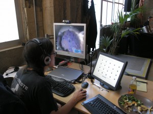
So what did we do, then? Since we weren’t able to actually go out to users’ homes (though we definitely pushed that idea), our Dear Leader Mr. Nate Bolt formed SNERD (the Simulated Native Environment Research Division) and set out to create a lab environment that was as similar as possible to a typical gaming setup: a desk, a chair, a laptop, and no other participants, research moderators, or observers to distract them. Unlike a focus group study, where participants would play the game for an hour and then talk about it in a group for another hour (ref. aforementioned bullshit), we had our participants play for six hours over two nights, without any explicit directions or instructions, except for one, which was to think-aloud as they played. We used TeamSpeak to hear what they were saying, and only occasionally dropped in with questions.
EA gets in on it
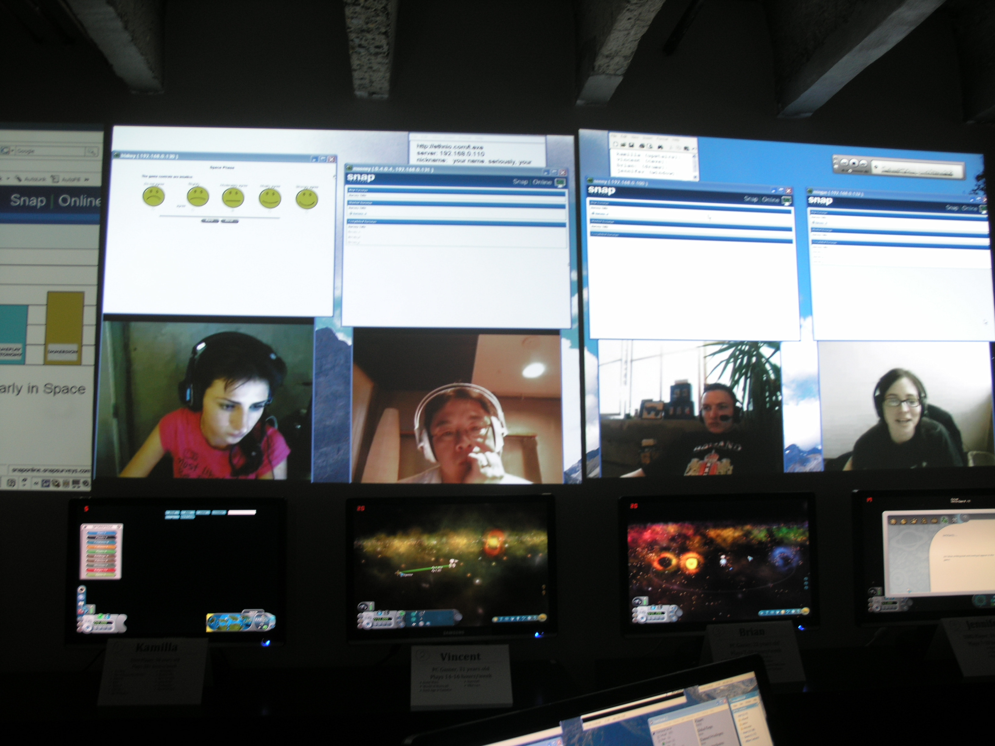
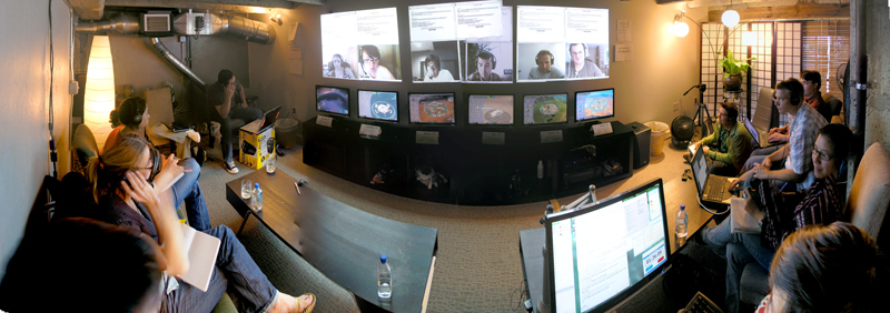
We, the research moderators and the observers from EA, were in a separate room, where we broadcasted the game screens, player’s faces, and TeamSpeak audio live. Even the EA peeps got in on the act: if they had questions, they let me know, so that I could address the players myself and rephrase any potentially leading or distracting questions (“Are you having a lot of fun now?”) into neutral moderator-speak (“Tell me what you’re doing here.”). This way, they were able to figure out what mattered to them, without swaying the feedback one way or the other.
PENS is mightier than the pen
Since we mostly do qualitative research, we don’t do many surveys and questionnaires, so to get the quantifiable data EA wanted, we worked with a great company in NY called Immersyve, who designed questionnaires and analyzed them using a set of fun and engagement metrics called PENS (Player Experience of Need Satisfaction). To keep players from getting bored or distracted when filling out the surveys, we used unobtrustive touchscreens instead of pen and paper, kept the surveys brief (<2 min), and instead of interrupting them, we asked them to fill the surveys out whenever they wanted to take a break from playing whatever phase they were on.
Oh yeah and it was also kind of insane
Not gonna lie, stuff got pretty B-A-N-A-N-A-S. It took practice to wrap our heads around the setup: six stations in different parts of the building, broadcasting 18 live streams of video to the observation room plus six streams of audio (gameplay video over VGA, webcam video over VNC, live touchscreen view over VNC, and TeamSpeak Chat over IP) while recording the gameplay, voice, and webcam data at the same time. I had to keep an eye on everyone’s progress, listen equally to all six users, take time-stamped notes so I could analyze the videos later, and keep an eye on my computer’s performance, since it was running something like five million screensharing applications. (On some of our first run-throughs, we had so much equipment running that we blew out the power in the entire building. Sploops.) Of course, from the gamers’ perspective, they were just kicking back and playing Spore.
393 Hours of HD Gamer Video
And that, in a nutshell, was it! Over the course of a year, we tested 59 users, logging 393 hours of individual gameplay. And to top it all off, we recorded the whole damn thing: player footage, conversations, and gameplay. The whole point of the study was to get the gamers comfortable so they’d say and do the kind of things they might not do in a self-consciousness provoking focus group or lab environment. Don’t believe us? Check it out:
[vimeo] http://vimeo.com/1704058 [/vimeo]

