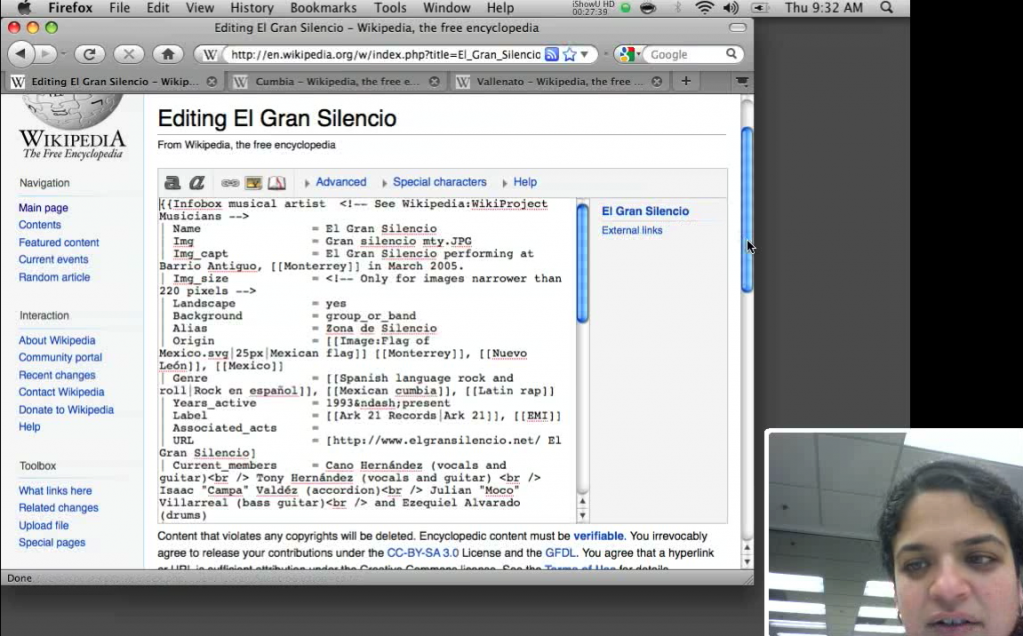
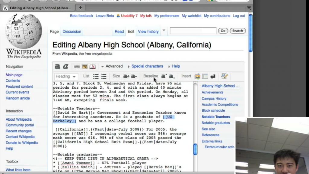
We’ve just wrapped up our second user research project for the Wikipedia Usability Initiative! The goal was to evaluate the usability of the editing process with the new Beta version that was made available a few months ago. Some choice user quotes:
“Before there were a lot of tools, and I liked that they were all spread out in front of you, but this actually makes a lot of sense. I had to muddle my way through the older system, but this one seemed fine.”
“Websites don’t have common sense, but programmers do.”
“Links are so easy to screw up. I’m not sure if we’ve correctly typed the link markup. Ah, there are these buttons…”
“Uh-oh, I think I may have made the wrong kind of link before. I’ll go to the preview window to see if this is a link. It would have been nice to just edit it in the preview.”
They’ve done a post on the process over at the Wikimedia blog, where you can read the report (with videos forthcoming!). And also check out our previous study on the Wikipedia editing process on the original interface, which contains a full report and highlight clips.

